The Best Paint Color Ideas for Open Floor Plans
Open floor plans offer a sense of spaciousness and togetherness, but decorating them can be a daunting task. Choosing the right paint colors is especially tricky, as you want to create a cohesive and stylish look throughout the entire space.
In this post, I’ll share simple yet effective tips and stunning color combinations to help you turn your open-concept home into a masterpiece.
(This post contains affiliate links, so I may earn a small commission when you make a purchase through links on my site at no additional cost to you. As an Amazon Associate I earn from qualifying purchases.)
I have a confession to make. I know it goes against every HGTV home buyer-renovater-house flipper-dream home episode, but I’m not really an “open floor plan kind of gal”.
There — I said it! (Please don’t hate me.)
Open floor plans can be a beautiful design choice, but they can also present unique challenges. One of the biggest challenges is choosing the right paint colors to create a cohesive and stylish look throughout the space.
As someone who prefers cozy, defined rooms, I’ve learned a thing or two about making an open-concept home feel warm and inviting.
In this post, I’ll share my tips and tricks for selecting the perfect paint colors for your open-concept home, as well as some color palettes to help you create a gorgeous look in your open floor layout — so you can love yours too, even if you’re a den-animal like me!
The Challenge of Selecting Paint Color in Open Floor Plans:
Open floor plans have been popular for a long time. Open plans where the dining room, living room, and kitchen area blend seamlessly foster an atmosphere of family togetherness and connectivity. They can, however, present a challenge when it comes to your paint choices.
Open floor plans present the challenge of maintaining a consistent visual flow throughout the entire space. The transitions between the living area, the dining area, and kitchen should feel seamless. You certainly don’t want a disjointed space, where the different areas feel like they belong in separate homes.
While the home design of more traditional plans often have separate, compartmentalized rooms, with the interconnected nature of an open concept spaces you need a consistent and cohesive color plan.
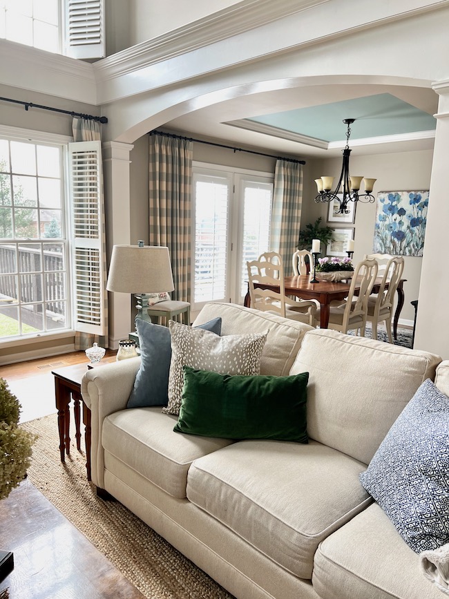
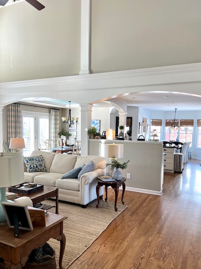
Since rooms openly flow into one another, the architectural features of the space can help define paint color placement. These features are your best friend in an open layout! They can be used to delineate where one color or shade transitions to another.
If you love color, these defined areas allow you to experiment with complementary colors, ensuring that each area feels unique yet remains harmoniously connected to the rest of the open space.
The Importance of Undertones in All the Spaces:
As with any style home, choosing the right paint color means you need to consider the undertones of color that exist in all of the areas open to each other.
Two different shades of paint might both claim to be beige, but on closer inspection, one might read a little warmer or a little cooler in relation to other colors. These slight variations in different tones within a shade must be considered when trying to create color harmony in all the spaces within open floor plans.
Consider the fixed elements in all of the room areas — the veins in a marble countertop, the undertones of your tile backsplash, or even the finish on your wooden fixtures. Each of these elements contributes its own undertone to the larger space since all of the spaces open into one another. They often possess subtle color hints that can either harmonize or clash with wall colors in your open space.
Identifying and matching these undertones is incredibly important when selecting open floor plan paint colors.
Color Palette Foundations:
Navigating the many different options for a color palette in an open concept floor plan can often seem challenging. Light neutral colors are generally best when selecting the primary wall color for your open space.
Neutrals as the Base:
Neutral colors, encompassing shades from crisp whites to deep taupes, are the cornerstone of a well-curated color palette for open concept floor plans. They offer versatility and present a canvas that’s both adaptable and timeless.
White walls have the power to magnify and enliven a space. Beiges and taupes are warm shades that turn vast spaces into cozy havens. Grays, which can range from cool to warm undertones, create a fresh backdrop in your open concept floor plan.
Neutral colors, especially the lighter shades, can make the whole area feel more expansive and breathable. With a neutral base as the predominant wall color, it’s easier to infuse and interchange accent colors through fabrics, artwork, or other decorative items.
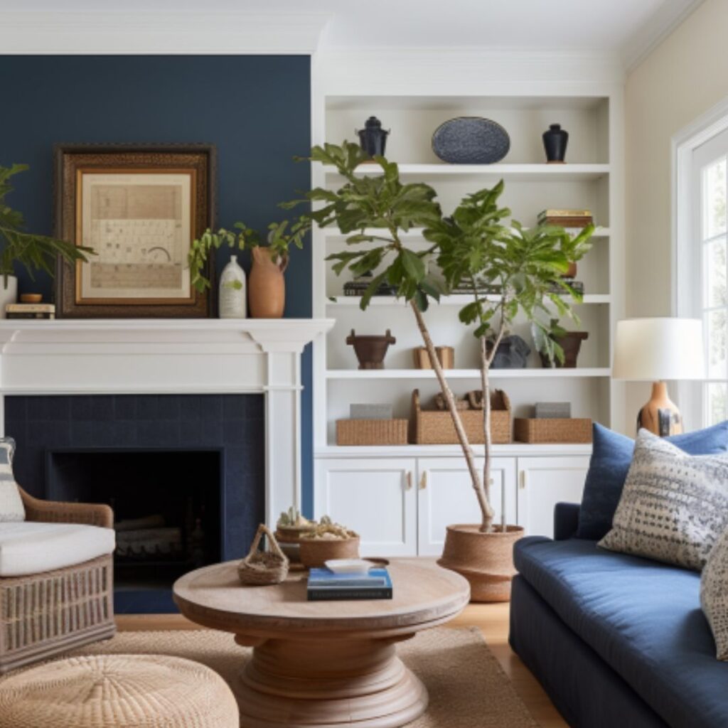
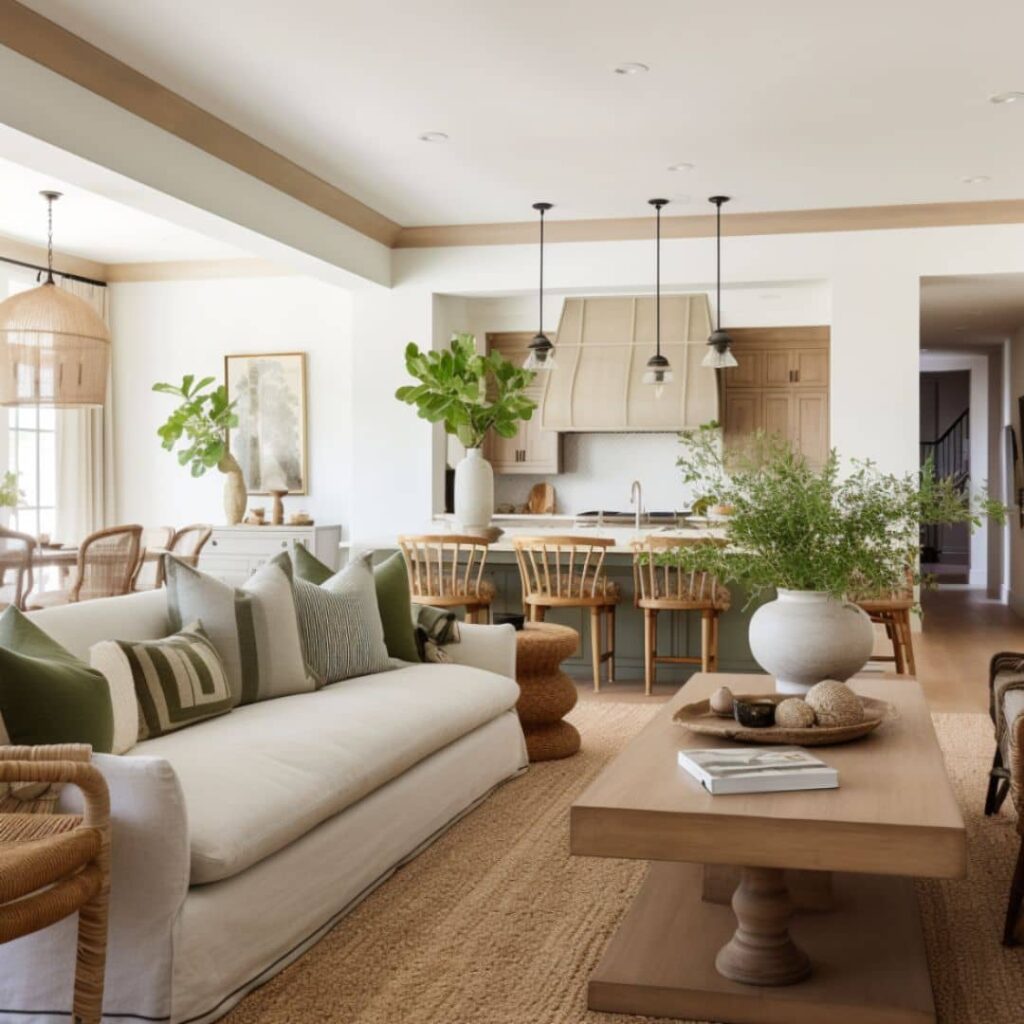
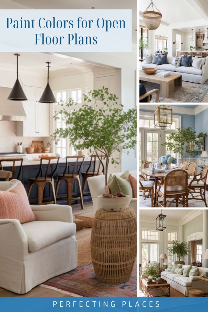
In the space above, the white walls provide a peaceful backdrop, while the blues and navy in the living room pillows and rug are carried into the kitchen area with navy accents on the lower cabinets.
By the way, don’t get too hung up on the details of these AI rendered photos. Some of the details get a little wonky! Try to let your eyes focus in on color placement around the space and how color ties the space together — rather than the sometimes awkwardly-placed light fixtures 😉
Adding Layers with Secondary Colors:
While the primary neutral wall colors establish continuity and a serene backdrop for your open plan, it’s the secondary colors that introduce character, depth, and dynamism to the living space. These hues introduce layers of complexity and visual intrigue. They are particularly effective when applied to features such as accent walls, tray ceilings, and areas distinguished by trim and millwork.

Areas like accent walls can be the ideal canvas for secondary colors that complement the primary neutral. They create focal points, directing attention and breaking up the uniformity of larger spaces. Spaces distinguished by trim and millwork, like wainscoting or built-in cabinetry, can be highlighted further with accent colors, turning them into standout design features.
Suggestions for Popular Secondary Colors:
- Sage Green: A muted green that feels organic and pairs well with earthy neutrals, making it a popular choice.
- Navy Blue: An excellent option that adds depth, especially when juxtaposed against lighter primary colors.
- Burnt Sienna: A warm, earthy tone that introduces a rustic charm, perfect for spaces aiming for a cozy feel.
- Dusty Rose: A soft pink that brings a touch of elegance without feeling too bold or out of place.
Remember, the key to success with accent colors lies in moderation. They should enhance the primary colors, not overshadow them. By incorporating them thoughtfully, especially in distinct architectural features, it’s a great way to achieve a layered, sophisticated look that feels both cohesive and dynamic in any living space.
Make a Statement with a Strong Accent Color:
While neutral and secondary colors lay the foundation and add depth to open floor plans, accent colors breathe life, personality, and distinctiveness into the space. These accents are typically dark or bold colors, meant to draw attention and define different spaces or features in your open floor plan layout.
Tips on Where and How to Incorporate Accent Colors without Overwhelming the Space:
- Balance is Key: Just as in nature, where a bright flower stands out against a muted backdrop, ensure your accent colors are balanced by more subdued shades in the surroundings. If you have a bold wall color, keep your furniture and décor in neutral tones.
- Limit the Number of Accent Colors: While it’s tempting to use multiple bold shades, it’s advisable to limit your accent colors to one or two. This keeps the space cohesive and avoids a disjointed or chaotic look.
- Consider the Size of the Area: Bold colors in a smaller area, like a powder room or a reading nook, can feel intimate and cozy. In larger spaces, it’s best to use them sparingly or in combination with patterns or textures that break up the intensity.
- Test Before Committing: Before painting an entire wall or purchasing a large piece of furniture in an accent color, test the shade in smaller doses. See how it looks at different times of the day and under various lighting conditions.
- Use Art and Décor: If you’re wary of committing to bold wall colors, introduce accent shades through art and decorative items. These can be easily changed or moved, offering flexibility and allowing you to experiment without long-term commitments.
- Target Specific Features for Deeper Shades: Areas such as a kitchen island, built-in bookshelves, or painted furniture pieces in the family room can be exceptional locations to introduce a darker accent color. A richly hued kitchen island can become the centerpiece of your cooking space, while built-in bookshelves painted in a contrasting shade can create depth and make your collection pop. Similarly, a piece of furniture, such as a console table or a chair, painted in a darker accent color can ground the space, adding character without overwhelming it.
Paint Color Palettes for Open Floor Plans:
If you’re decorating an open concept home and need some paint color ideas, I’ve put together two cohesive plans below.
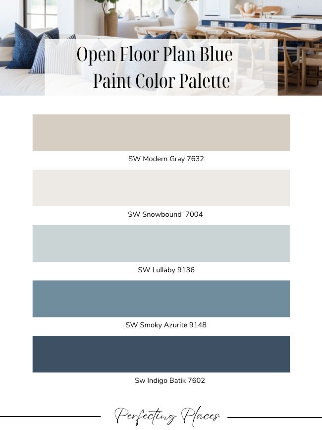
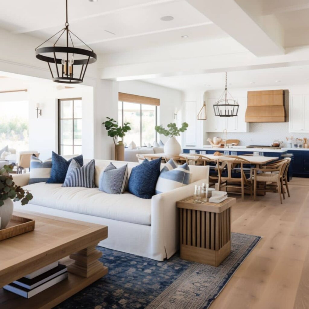
Blue Home Color Palette for Open Floor Plan:
In the blue color palette above, SW Modern Gray serves as the main or base neutral for the space. This would be the main wall color used to create a cohesive look through the rooms. SW Snowbound is a lovely trim color that pairs well with SW Modern Gray. It would also be lovely on the wall for areas that you prefer a white backdrop.
SW Lullaby is a nice light grayed-down blue that serves as a secondary color in the palette. It would be lovely on a contrasting wall or in an area that’s set apart by the architecture of the space.
Pair this with a rich accent color such as SW Smoky Azurite or SW Indigo Batik to accent cabinetry, built-ins or other features of the space.
Shop Blue Area Rugs
Click through for pretty rugs to define the seating areas in your open floor plan.

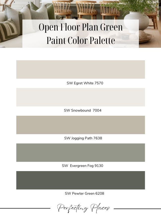
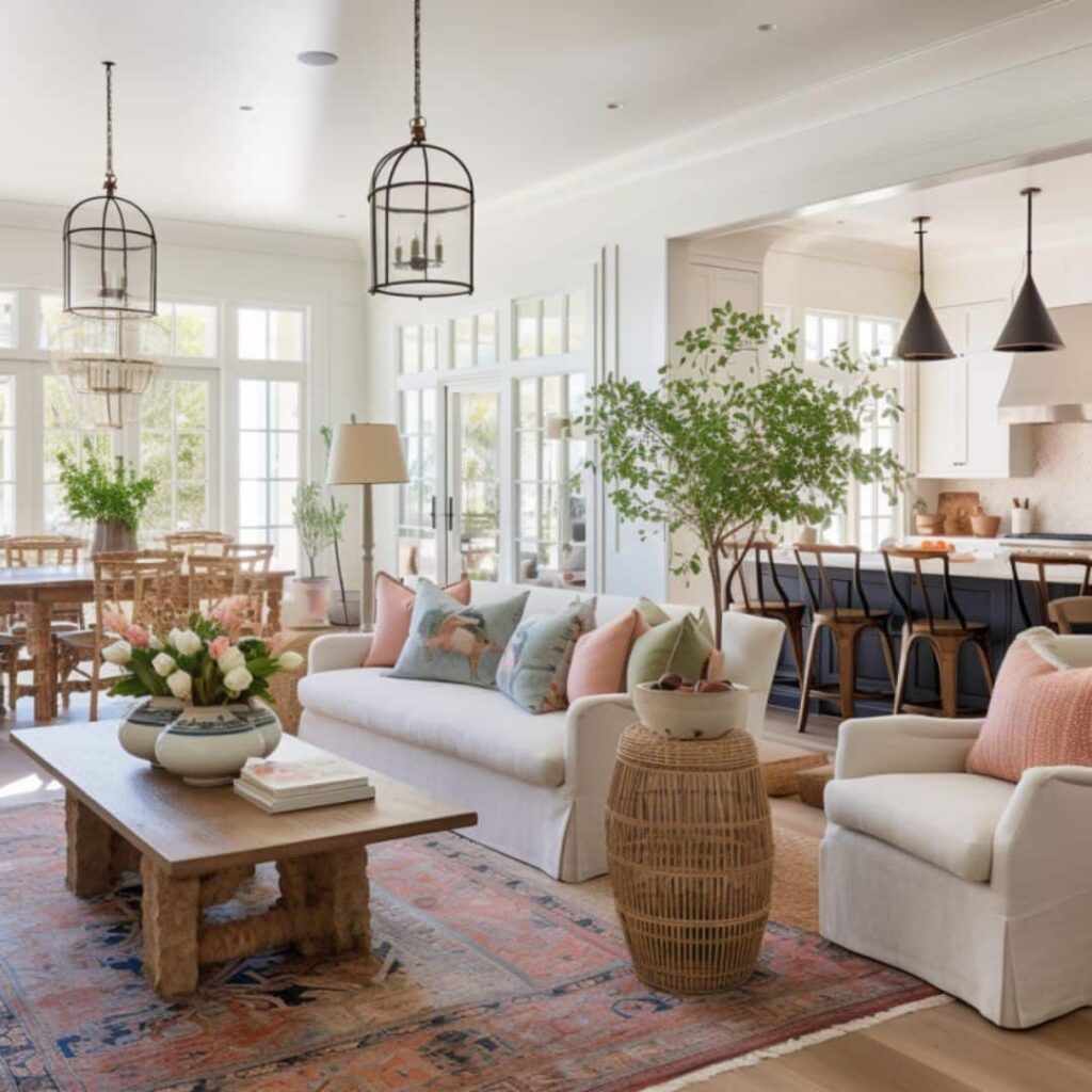
Green Home Color Palette for Open Floor Plan:
This open floor plan color palette features warm neutrals paired with shades of sage green. SW Egret White serves as the primary or base neutral throughout the space. It’s paired with SW Snowbound for the trim color. SW Jogging Path and SW Evergreen Fog can be used as secondary colors throughout the space.
Finally, SW Pewter Green is a rich green accent color for the space perfect for cabinetry and built-ins.
Shop Green Area Rugs
Click through for pretty rugs to define the seating areas in your open floor plan.
The Role of Natural Light:
Natural light plays an indispensable role in how we perceive colors in our homes. Sunlight, varying in its intensity throughout the day, can significantly alter the appearance of different paint colors. Morning light tends to be cooler, casting colors in a crisp, clear light, while the afternoon and evening sun bring out warmer tones, sometimes even deepening or muting certain hues.
For this reason, when you’re selecting paint for an open floor plan, especially in areas with plenty of natural light, it’s crucial to test paint samples at different times of the day.
Here are a few tips to ensure you pick the perfect hue:
- Utilize Sample Boards: Instead of applying paint directly to the walls, consider painting large pieces of poster board. This allows you to move the samples around to different walls and observe how the color reacts under varying natural light conditions.
- Don’t Rush the Decision: Allow yourself a few days to observe the sample different paint colors. Notice how they change from morning to night and even on cloudy days versus sunny ones. This extended observation can prevent potential regrets later.
- Consider the Seasons: Remember, the angle and intensity of sunlight change with the seasons. A color might appear different in the bright summer months compared to the softer light of winter. If possible, think about how the paint might look throughout the year.
By giving ample consideration to natural light, you ensure that your chosen colors remain harmonious and consistent, regardless of the time of day or year.

Future Trends in Paint Colors for Open Floor Plans:
As the world of interior design constantly evolves, so do the trends in paint colors. Predicting the future is never an exact science, but by observing current shifts and listening to industry experts, we can garner insights into where open floor plan paint color trends might be headed.
One notable shift is the growing inclination towards warmer neutral hues. We see a resurgence of beiges, warm taupes, and soft terracottas. These colors evoke a sense of comfort and coziness, aligning with a broader trend towards creating more nurturing and restful open space environments.
I share some of my favorite warm neutral paint colors in this post.
In tandem with these warmer neutral colors, there’s a growing popularity of warmer shades in general. Think of earthy browns, deep mustards, sage greens, and rich ochres. These colors, while bold, are rooted in nature and bring a grounding quality to living spaces.
One interesting impact from the pandemic closures is a renewed interest in more traditional home layouts. In response to the challenges of work-from-home setups and the need for more multifunctional rooms, many home buyers have begun to look for more traditional layouts with defined rooms.
And, with more defined room spaces, you have greater latitude to play with bolder, more intense colors. Deeper greens, blues, and even jewel tones like sapphire and emerald are making a statement in these newly demarcated spaces. These colors, while intense, create rooms with character, depth, and a sense of individuality.
If you have an open floor space that needs a little updating I hope these color schemes give you a great starting point toward a fresh start for your space!
Happy Painting!


Great article. I have a north facing house in south Florida. It’s open concept and has large windows with tons of light. I want to paint my dining room in Pewter Green and the rest of the living area in aesthetic white walls with pure white trim and iron ore doors. Being that it’s open concept, can I make the walls of the dining room dramatically different?
Thank you so much, Jade! Yes, you can certainly accent your dining area with the darker color, Pewter Green. Just make sure you incorporate that color and gradations of that color with fabrics and accessories around the open space. Pull it into your living room in pillows, rugs, or other fabrics and accessories. The Iron Ore interior doors will repeat the darker colors around the space as well. I think it will be lovely.