The Beautiful Blue Paint Colors of the Year (2024)
2024 is all about the color blue! See why blue paint colors are the go-to choice for timeless home elegance.
From serene shades of the sky to refreshing coastal tones, blue has taken center stage in this year’s paint trends with most of the major paint brands. Shades of blue are loved by so many (including yours truly), and these blue paint colors will bring tranquility and depth to any space in your home!
(This post contains affiliate links, so I may earn a small commission when you make a purchase through links on my site at no additional cost to you. As an Amazon Associate I earn from qualifying purchases.)
2024 is shaping up to be the year of blue, and I’m all for it! Since the majority of people choose blue as their favorite color, this should be a year of “color happiness”!
Blue is my favorite color, and I’m all about using shades of blue throughout our home.
What are the blue paint colors of the year for 2024?
2024 seems to be having a ‘blue moment’ when it comes to home decor. From leading paint companies to interior design enthusiasts, everyone’s talking about the various shades of blue hues that are making waves this year. These standout blue tones that have captured the spotlight and are setting the tone for homes across the globe.
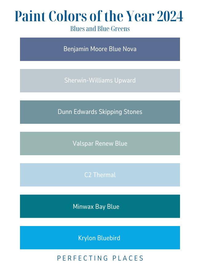
This year’s selections offer a range of choices that cater to different tastes and moods. Whether you’re leaning towards a gentle pastel or a deeper shade, there’s a perfect blue paint color that’s just waiting to transform your space.
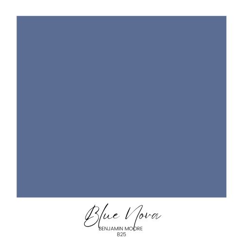
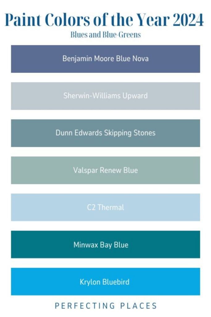
Benjamin Moore Blue Nova 825
Looking for a paint color that really makes a room pop? Benjamin Moore’s Blue Nova 825 could be exactly what your home needs. Imagine painting an entire room with this deep, engaging blend of violet and blue—it creates a space that’s both rich and captivating.
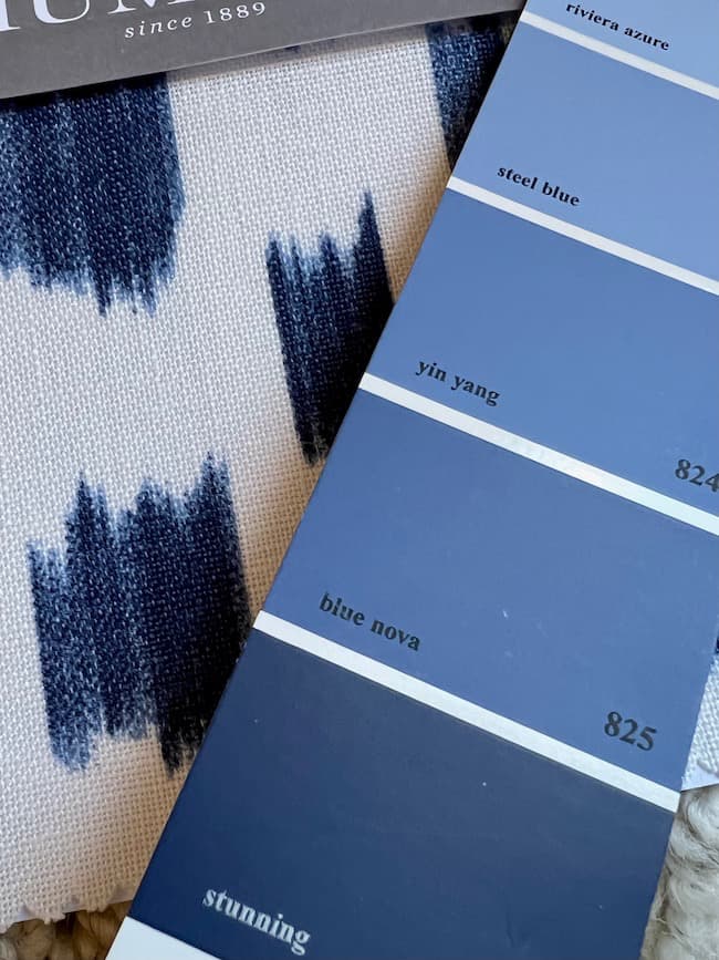
This color strikes the perfect balance, making any room feel cozy yet sophisticated at the same time. It’s more than just a paint; it’s a way to transform your living space, adding a unique and modern touch that feels welcoming and fresh.
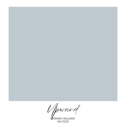
Sherwin Williams Upward (SW 6239)
Looking for the perfect hue that brings peace and a touch of beautiful light into your living space? The fresh light blue, SW Upward by Sherwin-Williams is your answer. Described as a ‘breezy, blissful blue,’ this color captures those rare, calm moments when we pause and simply breathe.
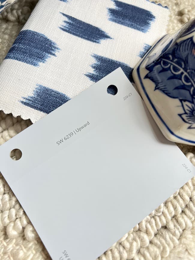
Painting a room with Sherwin Williams Upward not only radiates a soft, inviting glow but also establishes an oasis of tranquility in your home. For homeowners aiming for walls that evoke both calm and clarity, this shade hits the mark.”
I shared some pretty color palette pairings with SW Upward in this post.
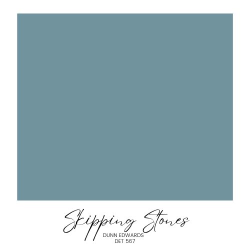
Dunn Edwards Skipping Stones DET 567
Dunn Edward’ Skipping Stones DET 567 is described as ‘a serene and steely blue shade’ This shade masterfully intertwines blue with hints of green and gray, creating a palette reminiscent of the vast ocean. It captures the calming essence of the sea while also radiating an energizing spirit. Skipping Stones will bring a piece of the coast into your home. For homeowners wanting a color that soothes yet invigorates, this blue-green shade from Dunn Edwards offers the perfect balance.”
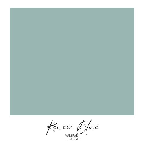
Valspar Renew Blue 8003-37D
If you’re on the lookout for a paint color that instantly brings calm and serenity into your space, Valspar’s Renew Blue 8003-37D should be on your radar. It’s not just any blue; this mid-tone blue is uniquely enriched with strong green undertones, giving it a refreshing depth that you can’t help but notice. Painting a room with Renew Blue is like enveloping yourself in a gentle embrace from nature.
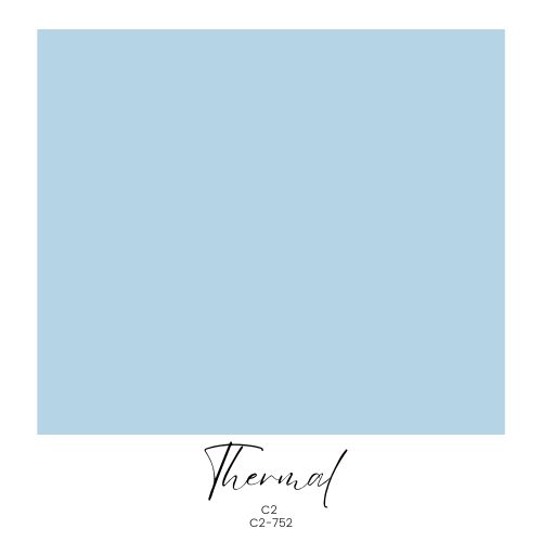
C2 Thermal C2-752
Looking to give a room a fresh, light blue makeover? Consider C2 Thermal C2-752, their standout Color of the Year for 2024. It’s a unique blue that’s both “invigorating and calming” at the same time, as described by C2. Perfect for anyone thinking about creating a serene blue room or just adding a touch of calm to a space, Thermal is an easy choice for a fresh, relaxing look.
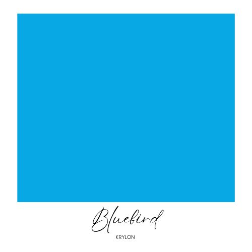
Krylon Bluebird
When it comes to making a statement with color, Krylon’s Bluebird doesn’t shy away. This light vibrant blue is the boldest of the blue choices. If you’re aiming to inject a vibrant color into your space, try this bold paint color on a fun accent piece. A little goes a long way with this color!
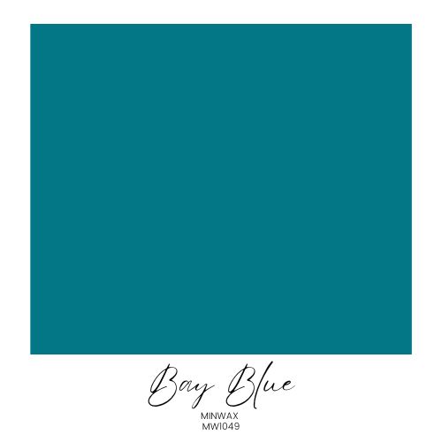
Minwax Bay Blue
Minwxs chose Bay Blue, a blue-green stain color, as their color of the year. They describe this intriguing deep blue green hue as a color that provides balance between our “real and virtual lives”, and one that embraces the comforting blues and greens of nature.
Why choose blue for your home?
Are you considering blue walls for your next home refresh? Blue creates a fresh look for your space, making it feel current and timeless at the same time. Blue is calming and restful. Remember the calm of the ocean or the vastness of the sky? That’s the way the color blue can make a room feel.
Whether you paint your room a fresh airy blue engulf the entire space in a deep velvety blue, it’s a great choice for those who appreciate classic style with a fresh modern feel.
How We Use Blue in Our Home: Our Home’s Favorite Blue Paint Colors
Shades of blue are used throughout our home as wall colors as well as in room accents.
Dining Room Blues:
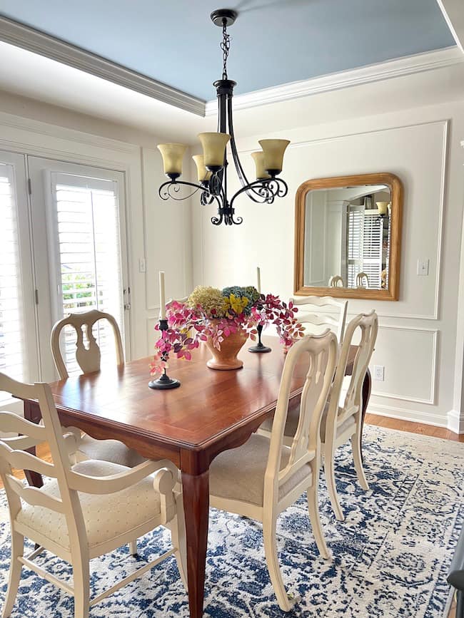
Our dining room is our most recent room project (which is still in progress), and it features blue as a focal point on the ceiling. We changed the wall color as well as the ceiling color.
The previous color on the walls was Benjamin Moore Tyler Gray (CW-50) shown below.
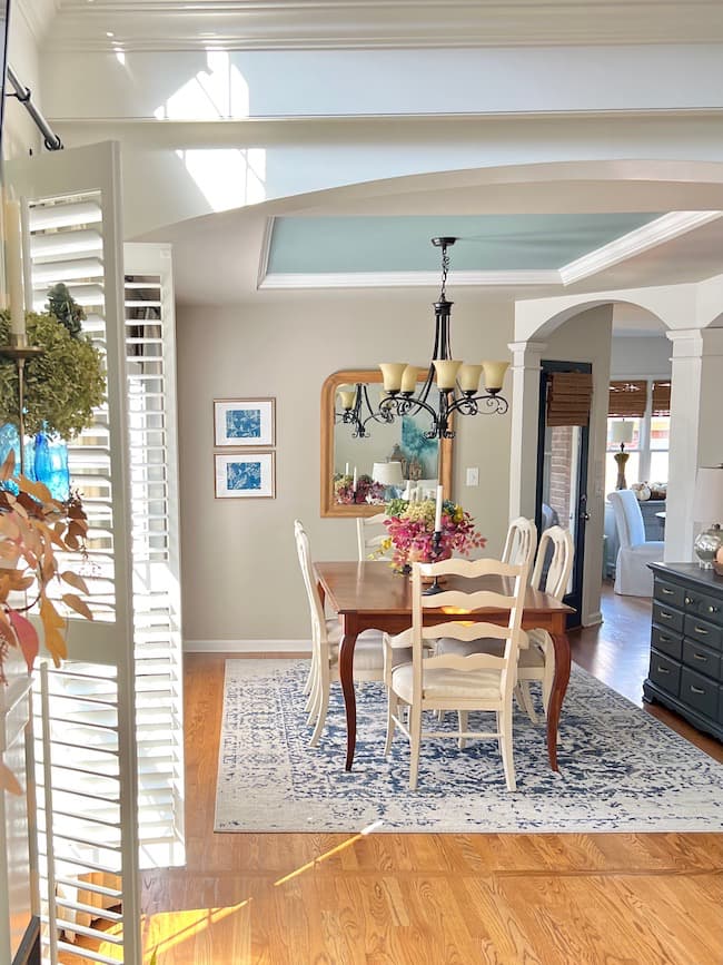
My sweet husband applied box trim millwork to the walls and then we painted them Benjamin Moore White Dove (OC-17) in a Satin Pearl finish for a classic look. Our tray ceiling inset was previously painted Benjamin Moore Stratton Blue (HC-142) which is a medium toned blue-green color.
I wanted to remove all the green undertones from the ceiling and go with a smokier rich blue so we painted the tray BM Little Falls.
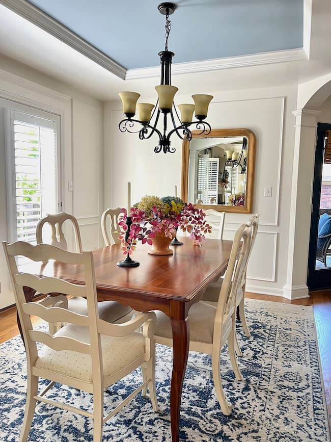
This new blue paint color really pops with the White Dove walls, and it looks much better with our blue and white area rug. The entire room already looks more elevated, and the room refresh isn’t even finished yet.
Favorite Blues in Our Primary Bedroom and Bath:
Our primary bedroom and bath color palette is made up of soft coastal blues and off-white.
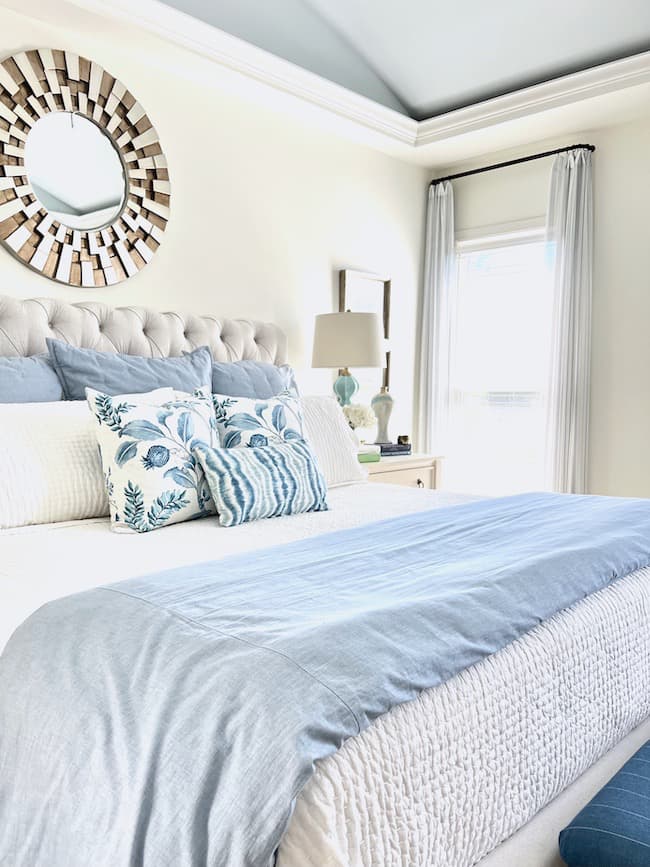
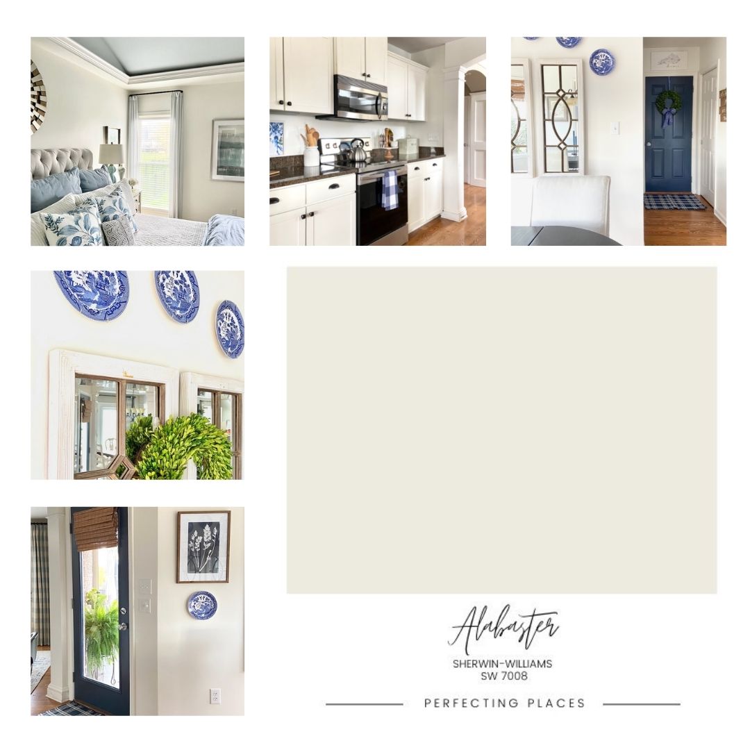
Our bedroom walls are painted Sherwin-Williams Alabaster (SW 7008) and our barrel ceiling is SW Lullaby (SW 9136) for an airy peaceful look. Our bedding repeats these subtle shades of blue.
We carried this color scheme into our bathroom with a pretty stenciled wall treatment in this palm frond pattern. This DIY project was a labor of love, and you can read all about it here!
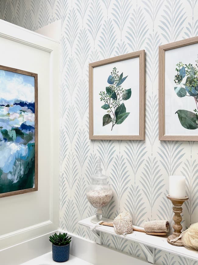
We first painted the backdrop to the pattern SW Alabaster, and then used SW Lullaby to create the stencil pattern on the walls. We love the timeless coastal look this created. It was a pain-staking process to complete the project; however, it was a fraction of the cost of wallpaper! This is the large wall stencil we used.
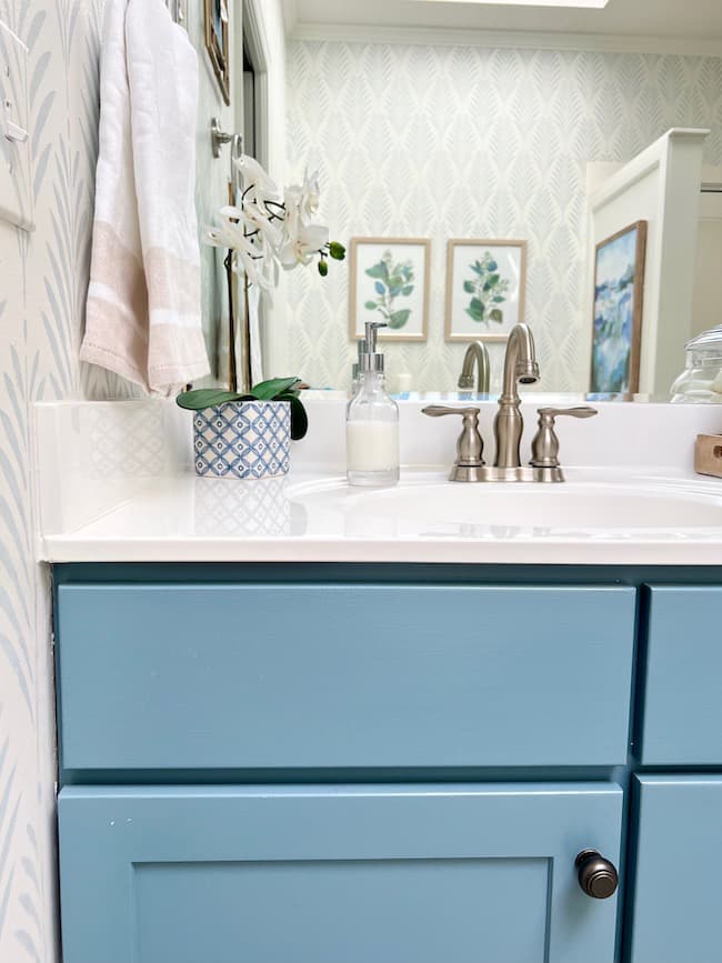
Our vanity is painted Sherwin-Williams Blustery Sky (SW 9140), a gorgeous rich blue, for a dramatic look! My friend Kelly, at The Tattered Pew, has her entire kitchen painted this color, and it is stunning!!
Blue Doors in Our Kitchen:
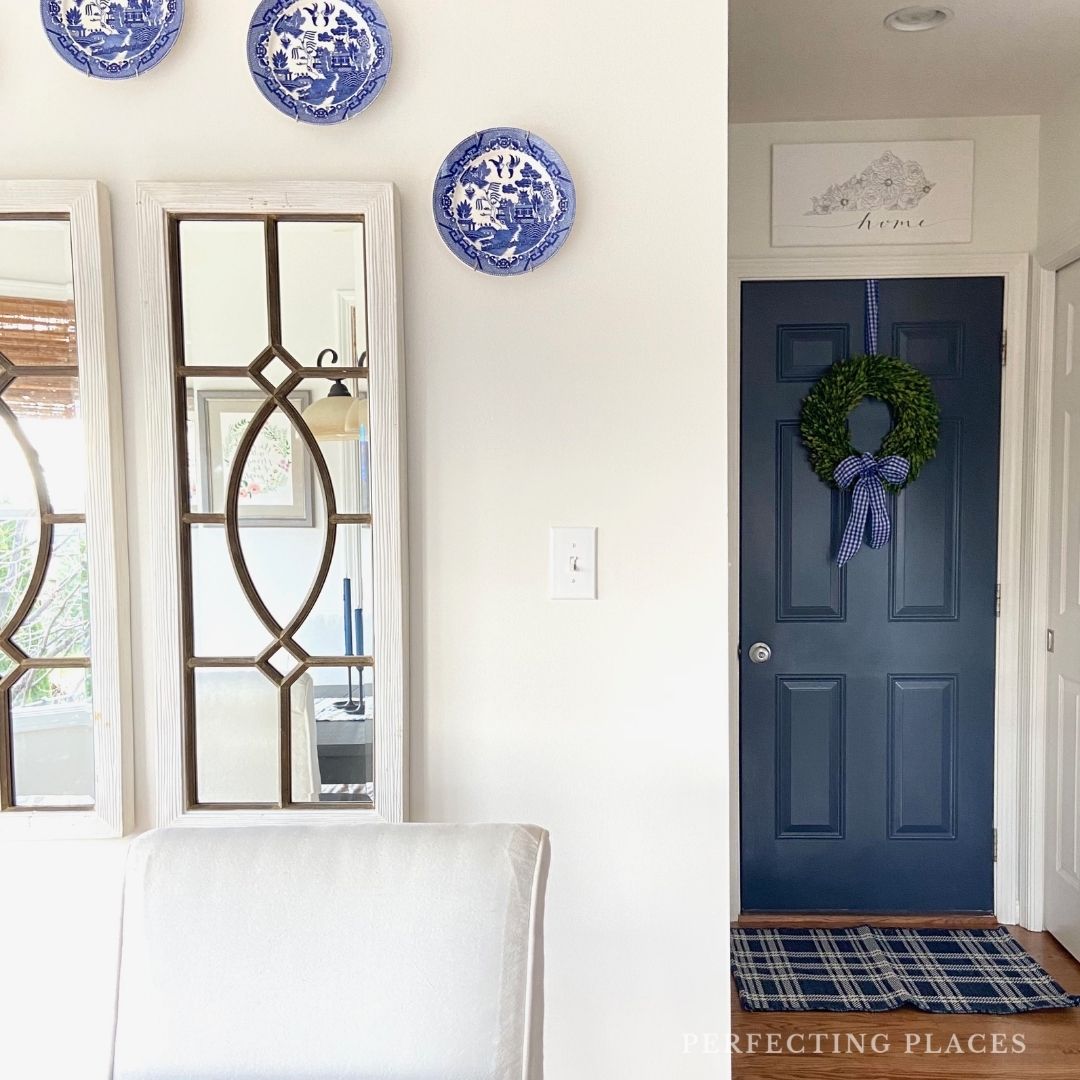
If you want to make a striking impression in your home, paint your interior doors a dark paint color for contrast! We painted our kitchen doors Benjamin Moore Hale Navy (HC-154), and they are gorgeous!
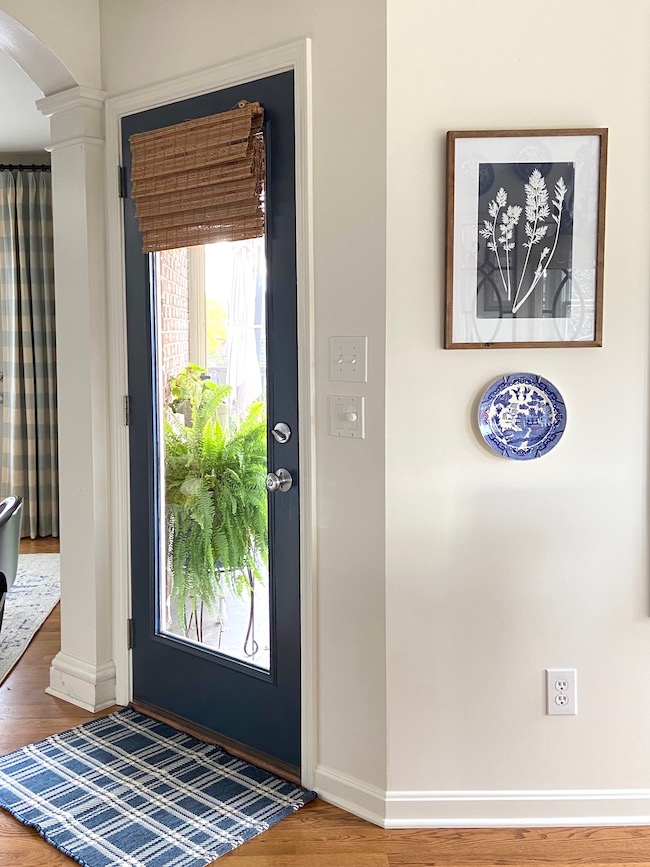
We love the contrast between the the navy doors and our Sherwin-Williams Alabaster walls! The doors add such rich depth of color to the mostly white kitchen. I’m still considered painting the dining room doors this color as well — the jury’s still out on that decision!
Gorgeous Blue Front Door:
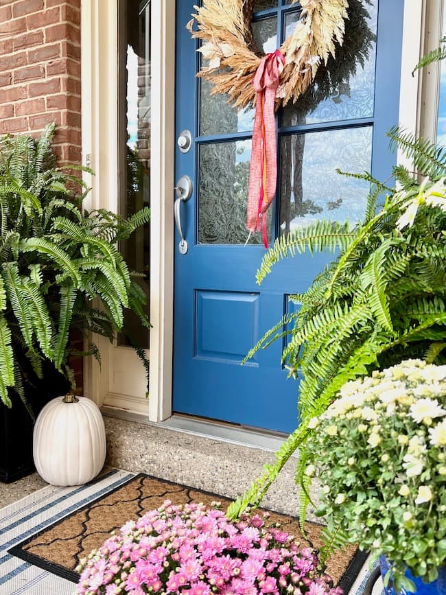
Our front door boasts a ton of curb appeal with this vibrant blue, Sherwin Williams Endless Sea (SW 9150)! It’s a little more vibrant than a dark navy, but still subtle. It’s a great choice for our shady north-facing covered front porch,
What are some other popular shades of blue from Benjamin Moore and Sherwin Williams?
- Hale Navy (Benjamin Moore): A timelessly rich navy blue that works in a variety of spaces. When it comes to navy, this is probably the most popular paint color for good reason!
- Storm Cloud (Sherwin-Williams): A moody mid-tone blue, perfect for creating a serene yet thoughtful atmosphere.
- Silver Mist (Benjamin Moore): A a soft misty blue with a silvery hint giving it a versatile and calming presence.
- Naval (Sherwin-Williams): A deep, bold navy that can make a dramatic statement in any room.
- Mount Saint Anne (Benjamin Moore): A beautiful medium-tone blue with grayish undertones.
- Van Courtland Blue (Benjamin Moore): A muted, sophisticated shade, bridging the gap between blue and gray.
- Languid Blue (Sherwin-Williams): A gentle blue with hints of lavender, creating a restful ambiance.
- Blue Danube (Benjamin Moore): A vibrant and deep blue, evoking feelings of depth and richness.
Again, for the best results, it’s always a good idea to test these blue colors in your intended space before making a final decision due to varying lighting and surrounding influences.

2024 has truly showcased some gorgeous blue paint colors. Whether you’re looking for a subtle touch or a dominant color to transform a room, there’s a perfect shade out there for you. As we’ve seen, blue continues to make a statement in home decor, proving once again its timeless appeal. Here’s to finding that ideal blue for your space!
Do you have a painting project coming up soon? A shade of blue might just be the perfect color for your space!
Happy Painting!




Love all these gorgoeus blues, Kim! what a great post.
Thanks so much, Wendy! There are some great color picks!