Sherwin-Williams Upward (SW Color of the Year 2024)
Are you looking for a soft subtle blue paint color? Sherwin-Williams Upward, their 2024 Color of the Year, is a great choice!
Discover how this versatile and tranquil shade of blue can elevate your home’s interior. Combine this color palette of fresh blues and neutrals from the Sherwin-Williams 2024 Colormix Anthology: Volume One collection into your fresh traditional decor for a look that combines livable elegance with timeless charm.
Fall is a favorite time of year for so many — the cooler temperatures, the glorious hues of changing leaves set against a backdrop of crisp blue skies containing fluffy white clouds, pumpkins, and apples, and cozy fall sweaters! This time of year is full of so many wonderful delights to the senses.
I love and look forward to all of these wonderful things, but one of my favorite things about this time of year is the Color of the Year announcements from each paint company!
I realize that might seem a little nerdy, but I can’t help it!
It’s so exciting to see what’s trending, or at least their best guesses of trending colors for your home.
Some years it’s spot on, and I get fully on board with the new color trends, while other years seem to miss the mark a little bit for me.
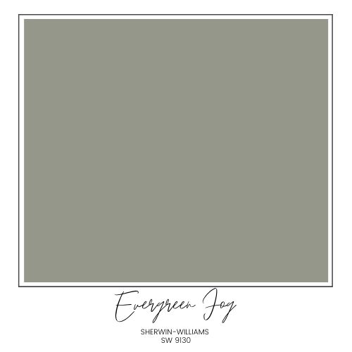
A couple years ago, most of the paint companies picked a sage green (SW Evergreen Fog, for example), and they really nailed it! Those color choices really reflected a shift toward earthy greens in interior decor. Sherwin-Williams Evergreen Fog is currently a very popular color for homes, and it’s still a strong part of their 2024 Sherwin-Williams paint colors Colormix forecast.
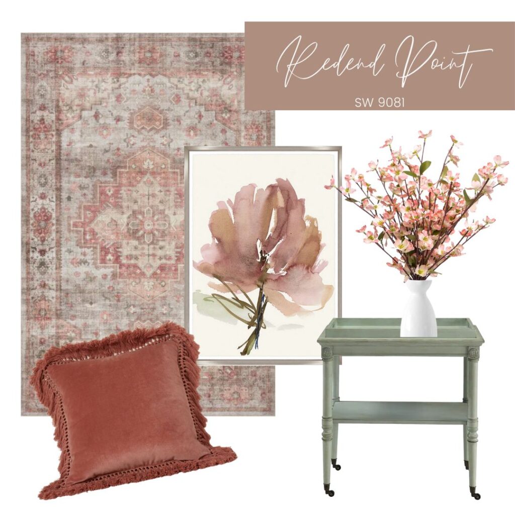
Last year, several of the companies trended toward shades of red and terracotta, and while it didn’t make quite as big of an impact for overall color shifts, I am seeing more reds and terracottas showing up in spaces and decorative accents.
If you love blue and white, this is your year with so many lovely shades of blue in the Sherwin Williams Colormix forecast, and SW Upward is a beautiful color to incorporate with your blue and white decor!
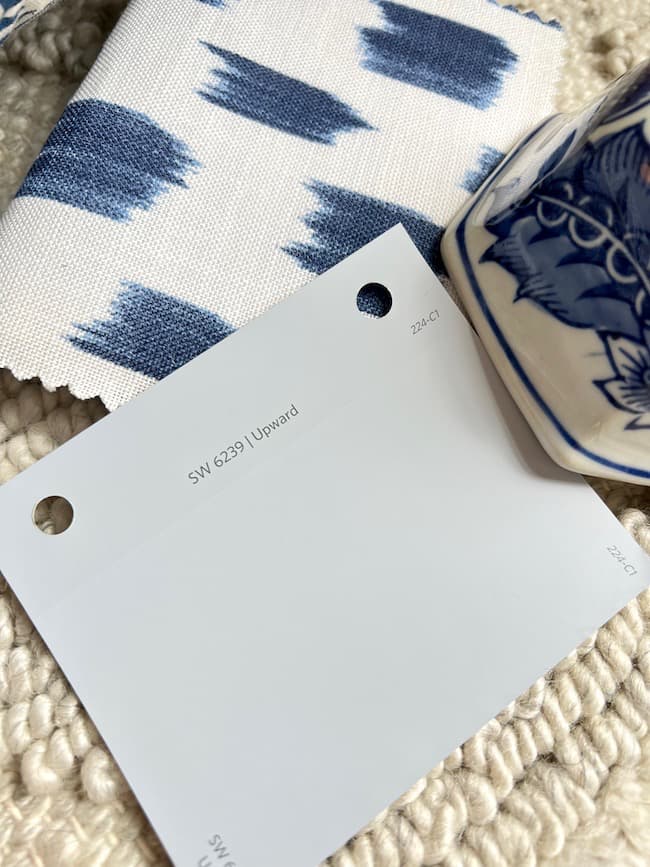
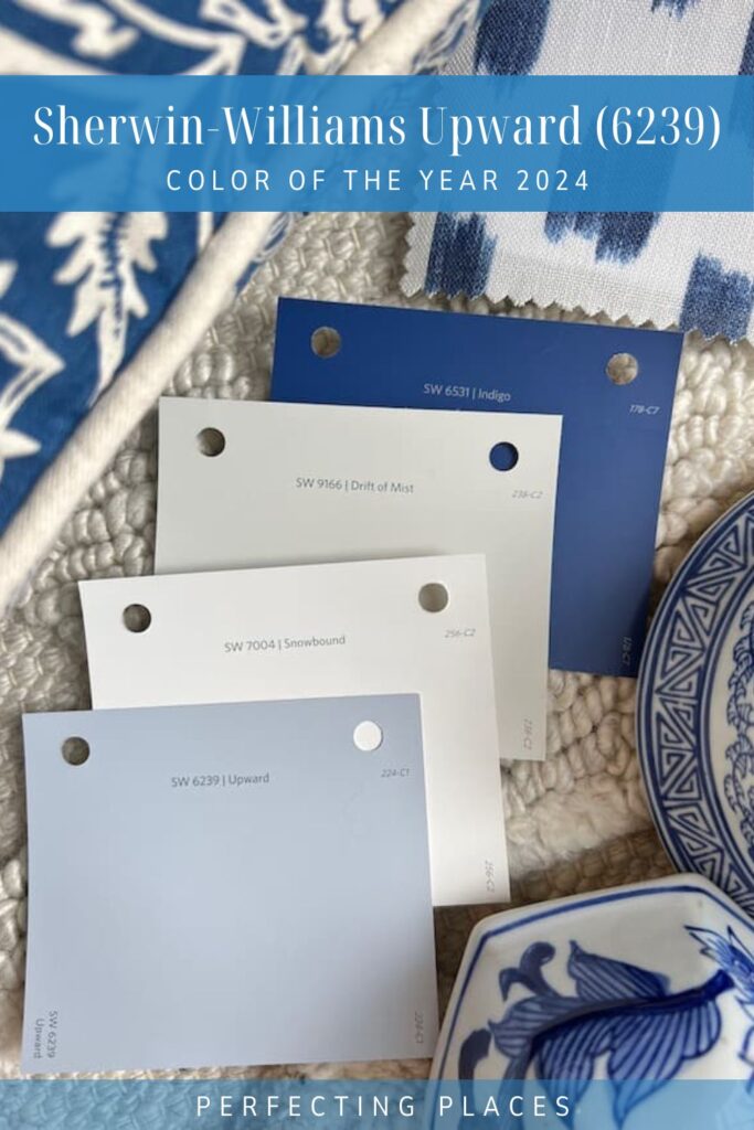
Introducing the Sherwin-Williams 2024 Color of the Year — Upward (SW 6239)
Upward is a calming subtle shade of light blue that blends the essence of sky and sea into a serene and versatile color. Sherwin-Williams describes it as a “breezy, blissful blue. The color found when we slow down, take a breath, and allow the mind to clear.”
And, well, who doesn’t need more of that?
What are the undertones of SW Upward?
This soft blue has plenty of gray undertones in it to keep it from feeling too “baby blue”, yet enough blue to feel like a color on your walls and cabinetry rather than a neutral.
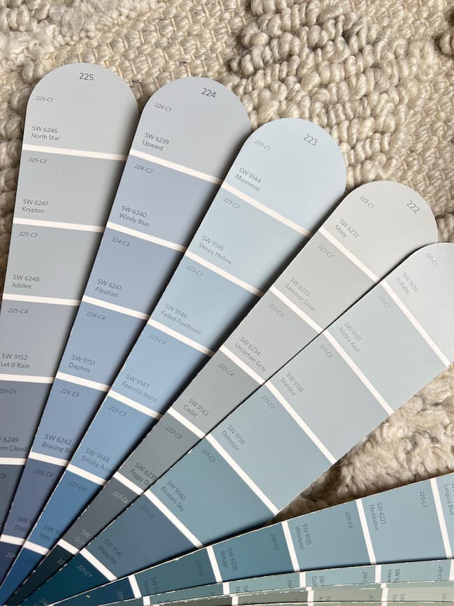
SW Upward has a hint of a purple undertone as you can see the color comparison in the image above. When you compare this color strip with the surrounding strips in the family of blue colors in the color deck you can see the purple tones. It really doesn’t have any green in it, as you can see compared to Strip 221 which begins to introduce some subtle green undertones.
I think it’s a little more on the “cool” side of blue rather that the warmer side, so when pairing it with a neutral or white, you want to keep those colors from going too creamy. SW Pure White or Snowbound SW 7004 are lovely off-whites that would be perfect as trim color with Upward.
As with any paint color, different lighting affects how the color reads, so always, always test the actual color in different locations in your home before painting!
How to Use Sherwin Williams Upward (SW6239) in Your Home:
This shade of blue, though at the top of its color strip, has a darker light reflectance value that it’s surrounding blue counterparts in the SW Color Deck. With it’s concentrated blue color, I probably would not make it the main neutral on the walls throughout my home since it’s a very open plan, but rather as an accent color or complementary color in the space.
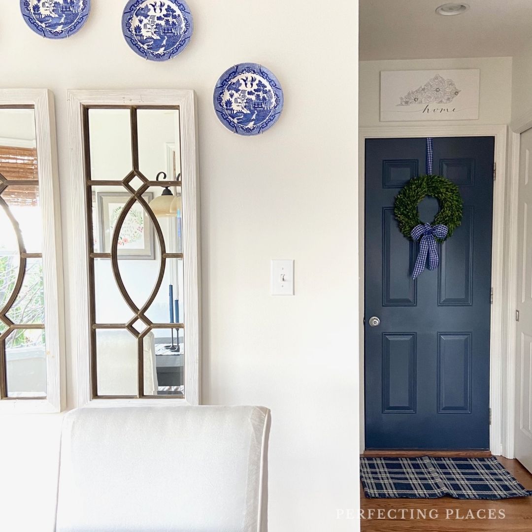
It would be lovely in a bedroom, though, or as a ceiling color. Upward would also be a lovely classic blue on the walls of an enclosed living room, particularly a room with walls embellished with detailed millwork and trim.
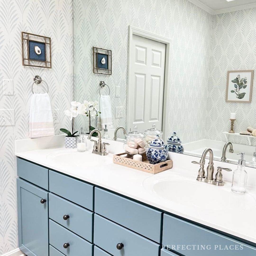
For a lovely classic look, a built-in bookshelf, kitchen island, or even bathroom vanity would be lovely in this shade of blue. I love it on kitchen cabinets, but you would certainly only want to do this if you plan to live in your own home for several years.
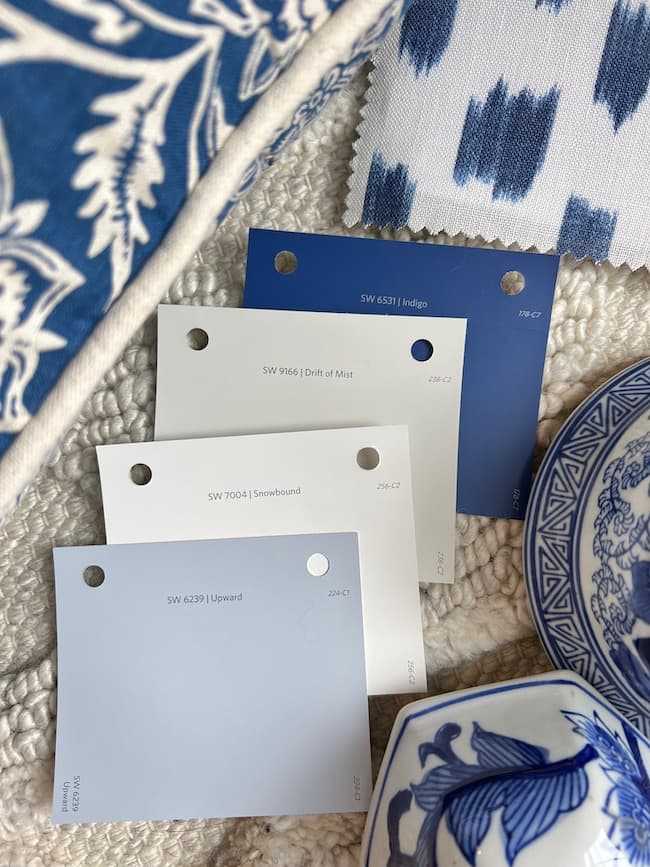
A Blue and White Color Palette Featuring SW Upward:
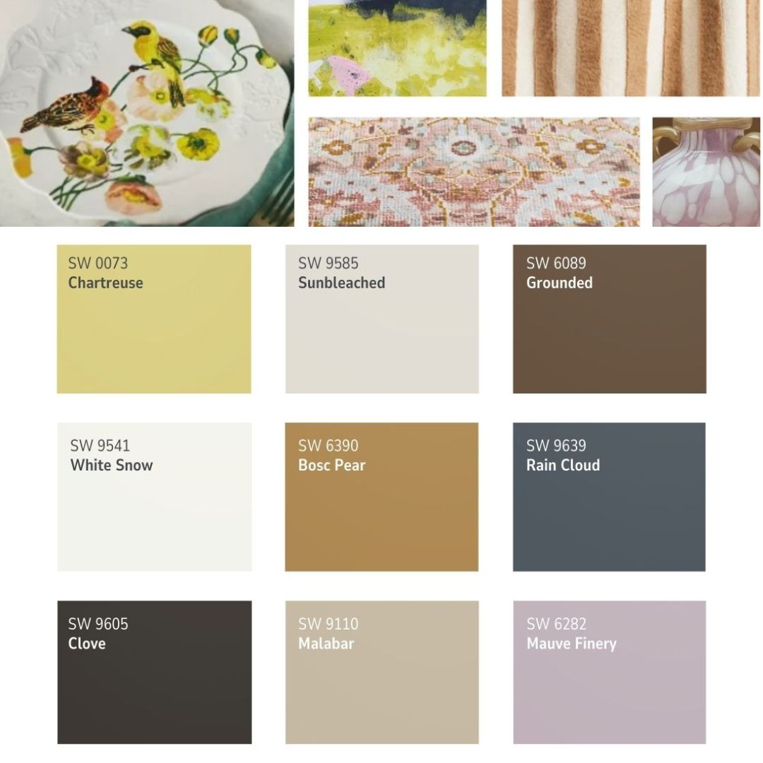
I’m loving so many colors in the 2024 Colormix Anthology: Volume One collection, and I’m especially partial to the blues and greens of color Collection #1! If you’ve followed this blog for long, you know blues and greens are my favorite colors to use in our home!
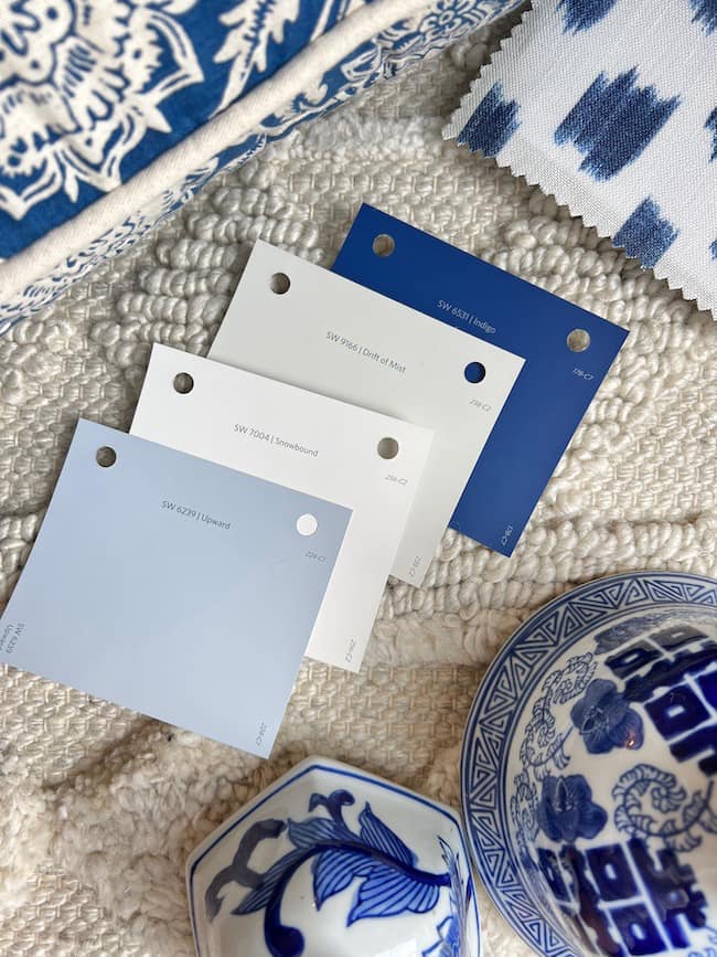
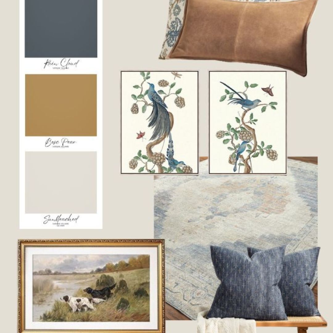
I’ve pulled a dark blue, a light neutral, and an off-white from the Anthology collection to create a lovely blue and white home color palette.
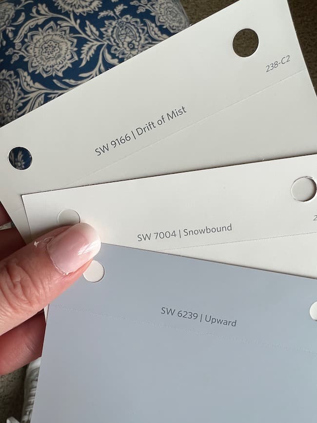
Drift of Mist SW 9166 from the Anthology “Delicate Tints” collection is a fresh neutral to use with SW Upward in an open floor plan. I’ve paired this with SW Snowbound as the trim color, and SW Upward is a great accent color in the space.
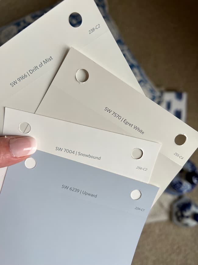
If you prefer a slightly warmer light neutral with a tiny bit more color, SW Egret White, also from the Anthology “Delicate Tints” Collection, is a great option.
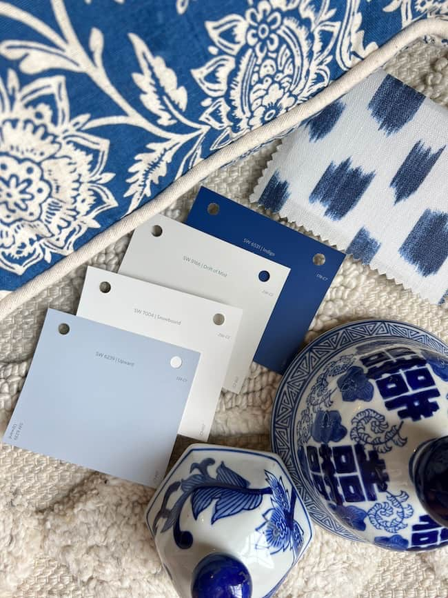
SW Indigo from the Blues and Greens Anthology collection is a lovely deep blue to pair with Upward. It’s a brighter navy, but if you love a more subdued navy, SW Indigo Batik, which is on the same color strip as Upward, would be a great choice!
Adding Shades of Green to the Color Palette:
You can expand this blue and white palette to include shades of green from the Anthology collection. I love the introduction of Evergreen Fog (the Sherwin-Williams 2022 COTY) with either Billiard Green or Pewter Green, in this home color palette.
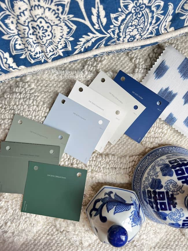
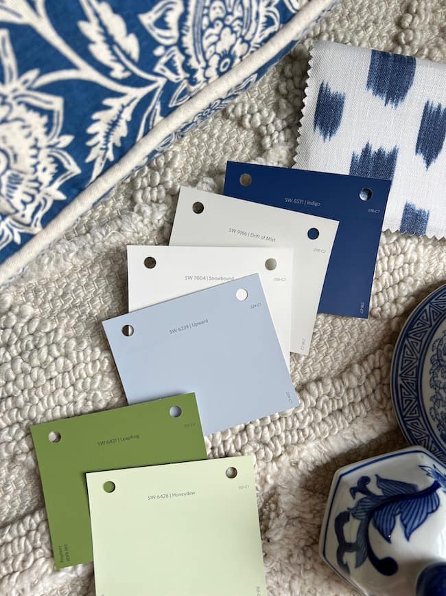
If you lean toward more vibrant greens you could mix in SW Honeydew or SW Leapfrog from the Anthology “Blues and Greens” collection for a fresh blue and green color palette.
Shop this curated collection of home decor in a blue and green color palette!
As we step into the coming year, it’s an ideal time to consider how a specific color can profoundly influence our living spaces. “Upward” is more than just a hue for your interior walls; it embodies the very notion of contentment, skillfully curated by the Sherwin-Williams Company. Whether you’re contemplating a complete redesign or a simple refresh, this lovely shade offers an endless array of design possibilities, making it a perfect fit for anyone seeking both style and tranquility.
Whether you’re looking to make a bold statement or simply infuse a touch of serenity into your home, Sherwin-Williams Upward is an airy cool blue that rises to the occasion. It’s more than just a color; it’s an invitation to elevate your living space to new heights of style and grace.
Happy Painting!




Thank you for this very informative post on paint colors. Also, I love the white and blue lamp. Do you have a link for it please? I love all your posts! Thank you!
Thank you so much, Denise! I so appreciate you following along! You can click on the picture of the lamp above. All of those pictures are direct links to the items. Or, you can click this link to the lamp as well. https://amzn.to/3LADBXT (affiliate) Thanks so much!!
Such a gorgeous color. Love it. It’s so calming.
I agree! It’s a lovely color! Have a wonderful weekend, Renae!
May I ask about the fabric swatch next to the dark blue paint chip? White background with dark blue color swipes. Looks like Ballard Design. Love it! Thanks😊
Hi Debbie. It’s Schumacher Izmir Ikat.