A Bold New Look: Introducing Moody Colors Into Your Neutral Home
Ready to inject a little color and depth into your neutral space? Transform your rooms with these gorgeous moody paint colors.
(This post contains affiliate links, so I may earn a small commission when you make a purchase through links on my site at no additional cost to you. As an Amazon Associate I earn from qualifying purchases.)
So, let’s talk paint colors today, my friend!
Just between you and me — I can get a little nerdy about paint colors! All those little chips of color, and fan decks, and paint sample boards make me happy, so when I get to talk about my favorite colors I do a little happy dance.
I’m all about light and airy spaces — light walls, lots of natural light, and that whole happy clean and fresh vibe that reminds me of the coast.
But let’s be honest, all-neutral homes can start to feel a bit… well, neutral. And while I love a good dose of sunshine, sometimes a bright and airy room needs something to ground it, to give it a little depth and soul … and that’s where moody paint colors come in.
If you love the classic coastal Serena and Lilly vibe, but are craving a little depth and color then read on! But don’t worry, if you’re not ready for full-on color-drenched rooms, I’ve got you covered with tips for adding pops of these colors in just the right places!
So let’s take a look at some of my favorite moody blues and greens and sophisticated dark neutrals for a fresh, cozy, and updated look!
What’s a Moody Paint Color?
No, it’s not a color that’s having a bad day! Quite the opposite, actually, because when you get them just right you’ll be jumping for joy!
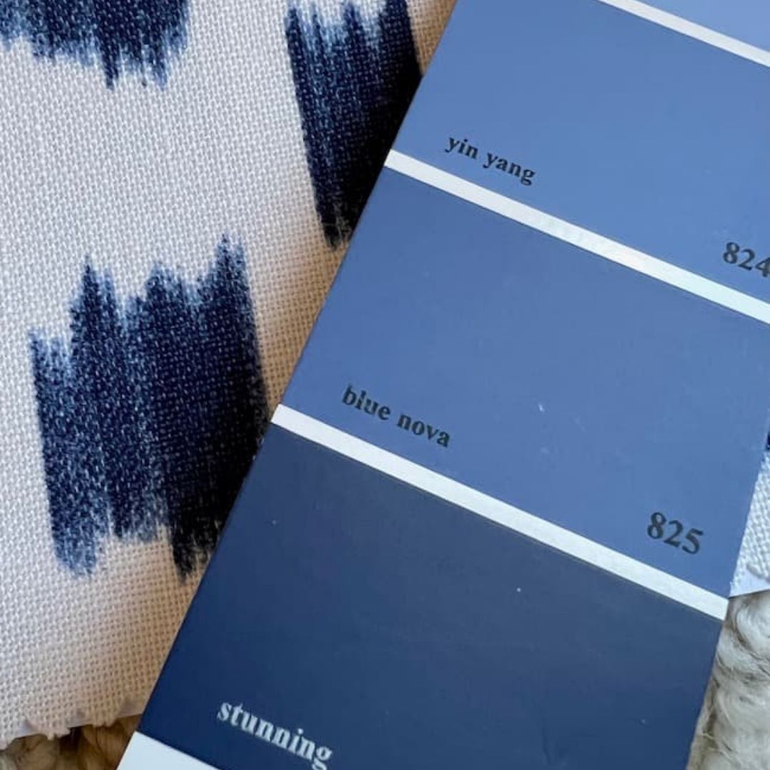
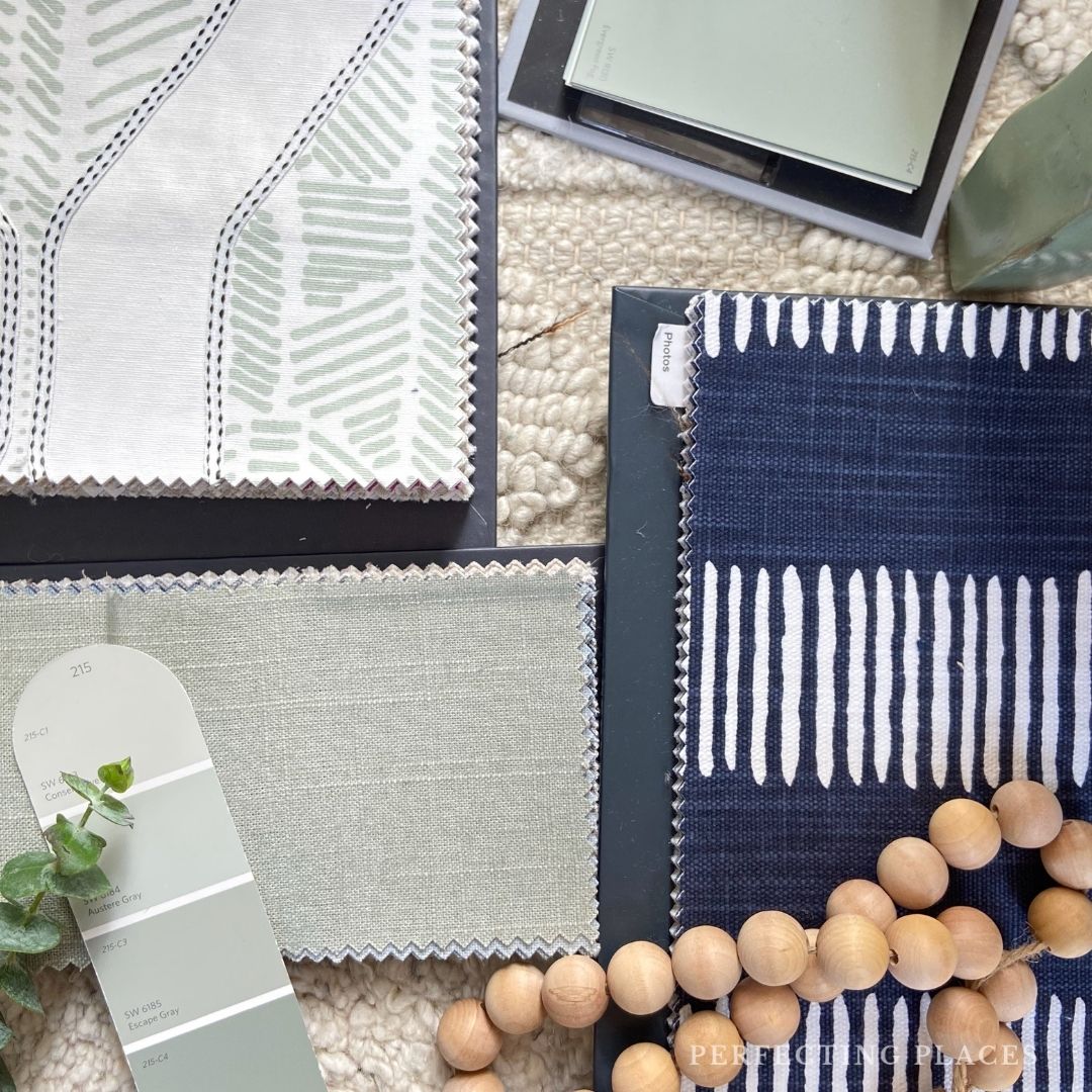
Let’s open up that paint fan deck, head straight to the neutral section — the more muted, muddied tones.
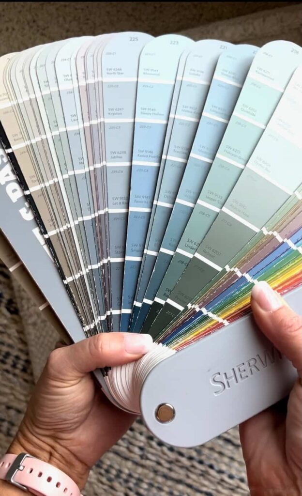
I’m talking the beiges and grays that bleed into the subtle shades with hints and undertones of blues and greens. Now drop down to the bottom two or three colors on those strips and that’s where you’ll find the moody colors.
They’re just a little bit murky and muddy, and the reality is — those are the absolute BEST colors to lean into when you want a rich moody color for your walls, or ceiling, or cabinetry or built-ins!
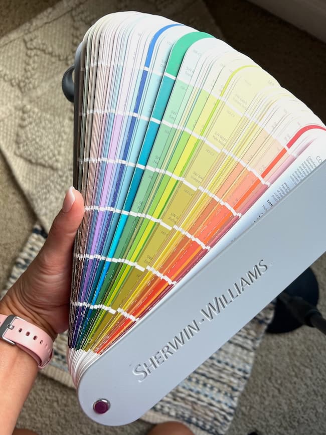
Stay away from the bright zone in the color deck – you know the color strips that your kids head straight to when they’re given permission to pick a paint color for their rooms. There are a few exceptions in the blue and green families at the bottom of the strips that can feel a little moody, but for the most part, avoid these brighter colors when you want a moody shade.
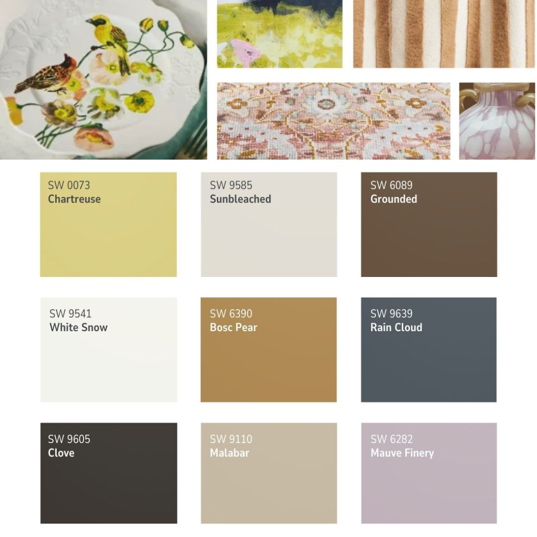
My Favorite Moody Colors
Now that you know where the moody paint colors live in the fan deck, let’s talk about some of my favorites!
Sophisticated and Calming Moody Blue Tones
If I could only pick one color to decorate with for the rest of my life, can you guess which one I would choose?
You guessed it — blue! I love to add touches of blue around our home, and these are some of my favorite moody blues to add depth and character to a space.
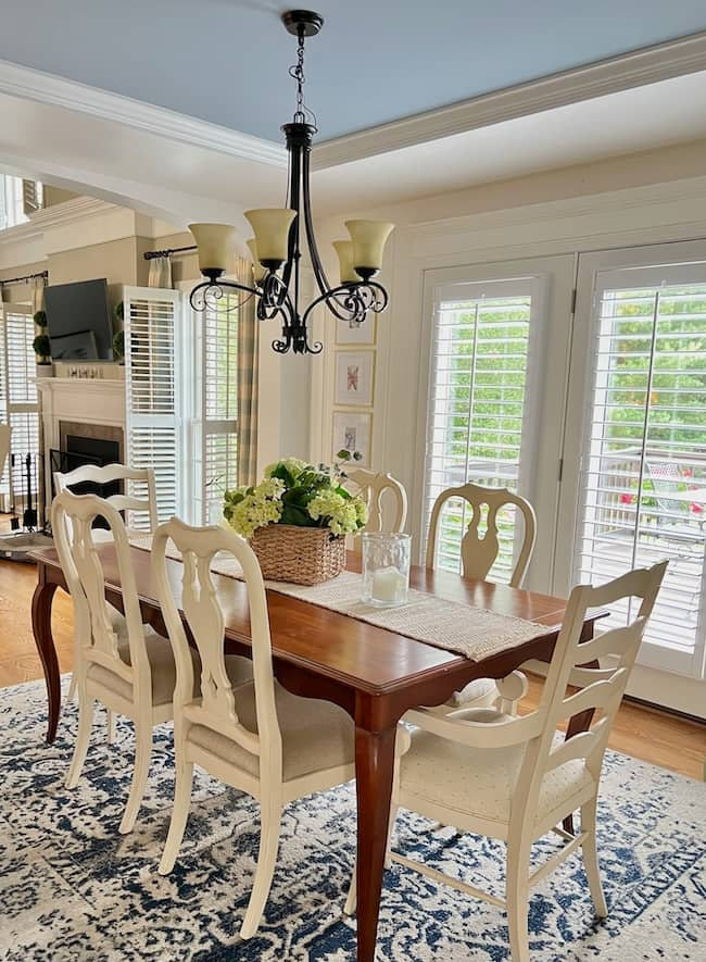
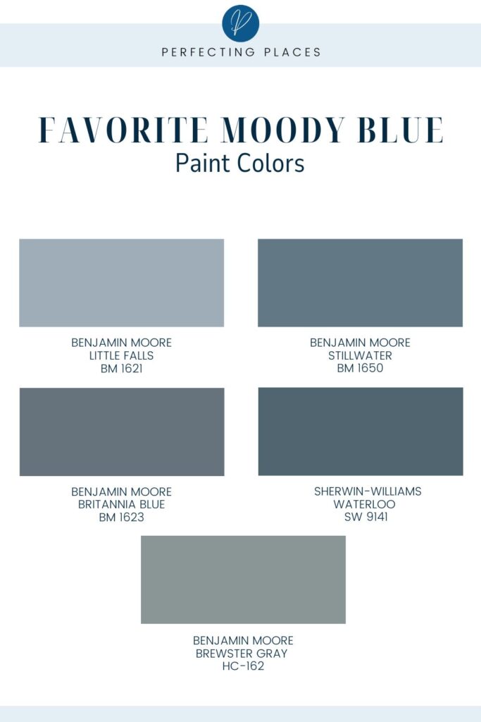
Benjamin Moore Little Falls 1621
Last fall, we painted our dining room ceiling Little Falls, and I absolutely love it! It’s a gorgeous mid-tone blue — not too dark, and not too light.
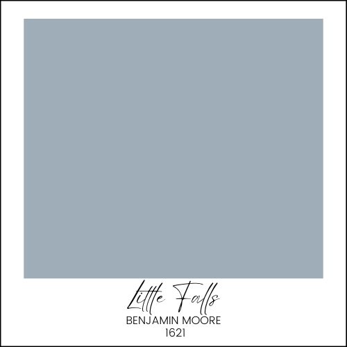
If you want to introduce a moody blue into your light and bright home gently, this is a great color to start with. A pop of color on your ceiling or on a built-in unit would be fabulous.
Want to see this color on walls? Click here to see how Laura U Design Collective saturates a study with this beautiful blue!
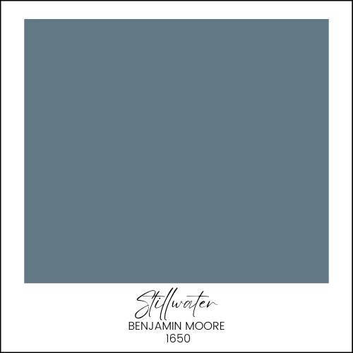
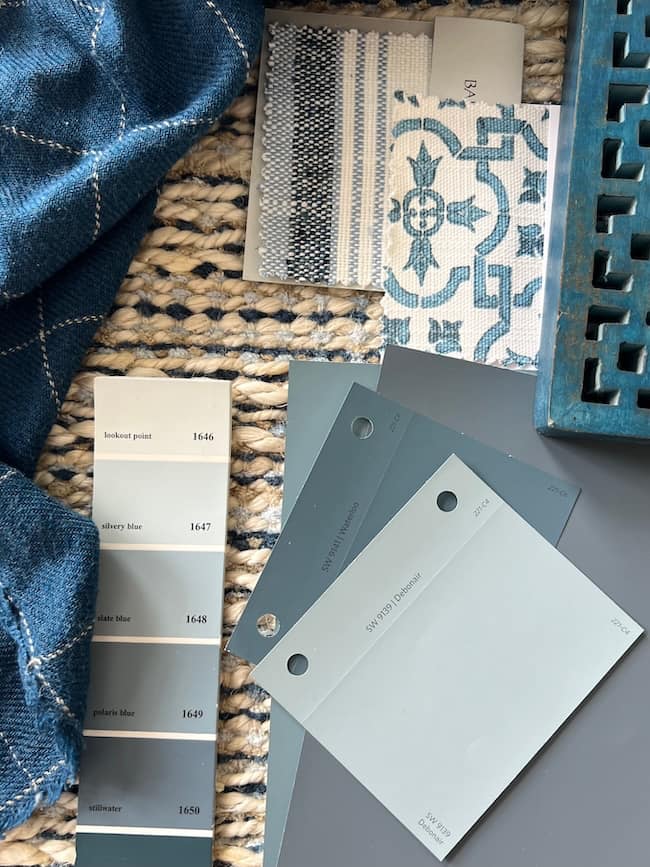
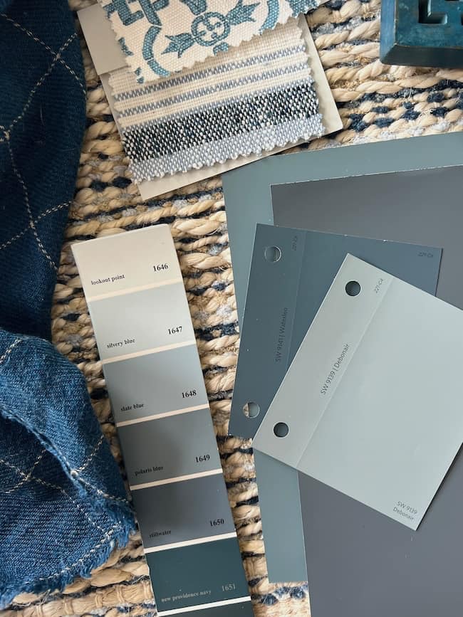
Benjamin Moore Stillwater 1650
Stillwater is a rich, deep blue. Emily Henderson painted her family room this color, and the result is stunning! Her color-wrapped room is absolutely beautiful, but if this color feels a little too intense for your living room walls, it would be lovely on a kitchen island or even on the walls in a small powder room.
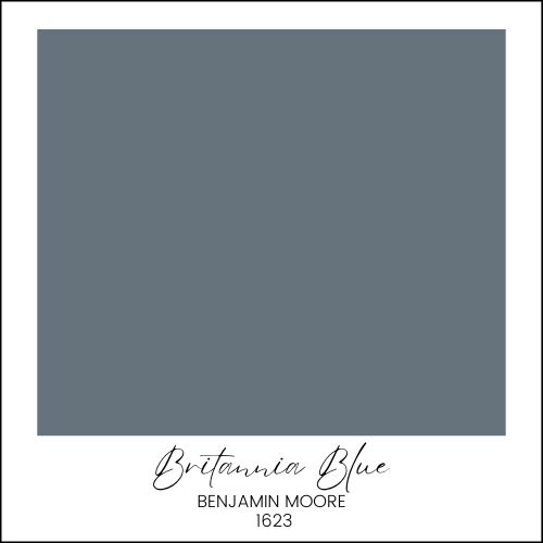
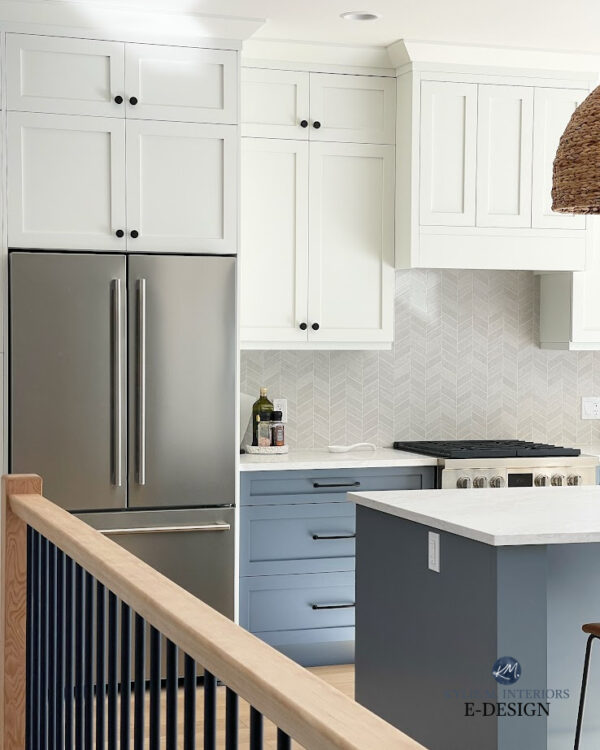
Benjamin Moore Britannia Blue 1623
This pretty blue strikes a nice balance between muted and vibrant. It’s lighter and brighter than a navy, but it adds gorgeous depth to a room. Look how pretty it is on the lower cabinets in the kitchen below at Kylie M. Interiors.
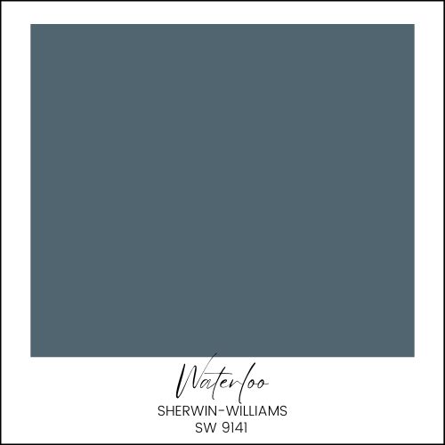
Sherwin-Williams Waterloo (SW 9141)
Waterloo is a strong, confident blue that commands attention without overwhelming the space. It’s perfect for creating a focal point in a room. Check out these fabulous mudroom built-ins painted Waterloo.
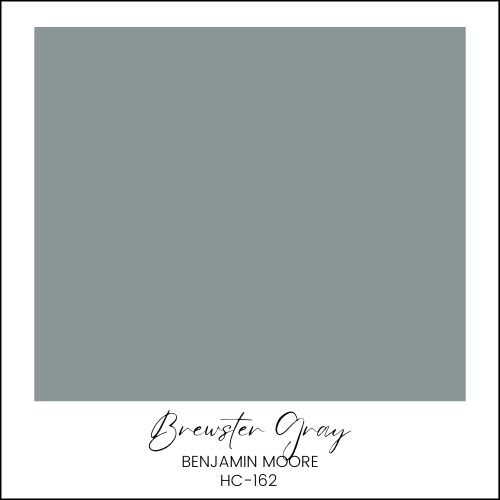
Benjamin Moore Brewster Gray HC-162
Brewster Gray is a timeless, muted blue-gray that’s so sophisticated and pretty. It’s perfect when you want a subtle hint of moody color without going too bold. This beautiful home by Bria Hammel Interiors features Brewster Gray on mudroom built-ins and cabinetry.
If blue is your favorite color for your home, check out this post about all the blue paint colors of 2024 in this post!
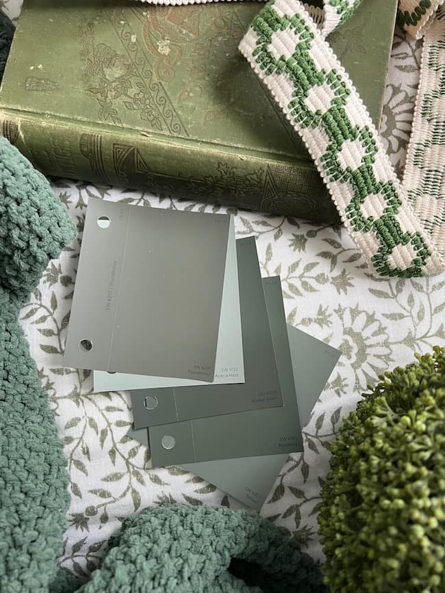
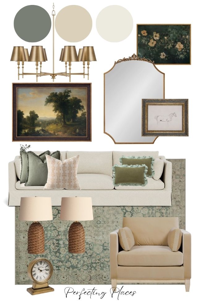
Moody Green Paint Colors
There are so many versatile greens that work to create cozy, nature-inspired rooms that are timeless and elegant.
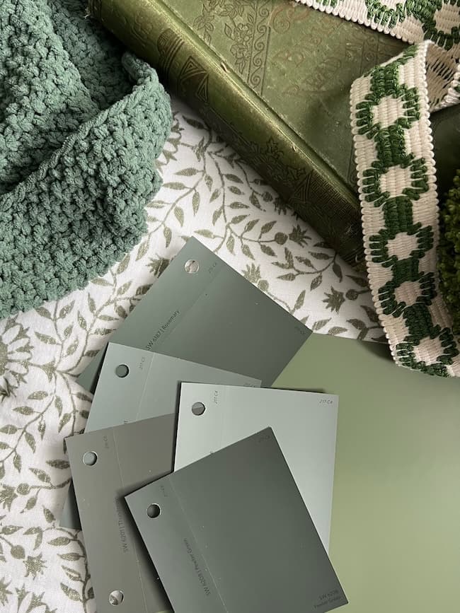
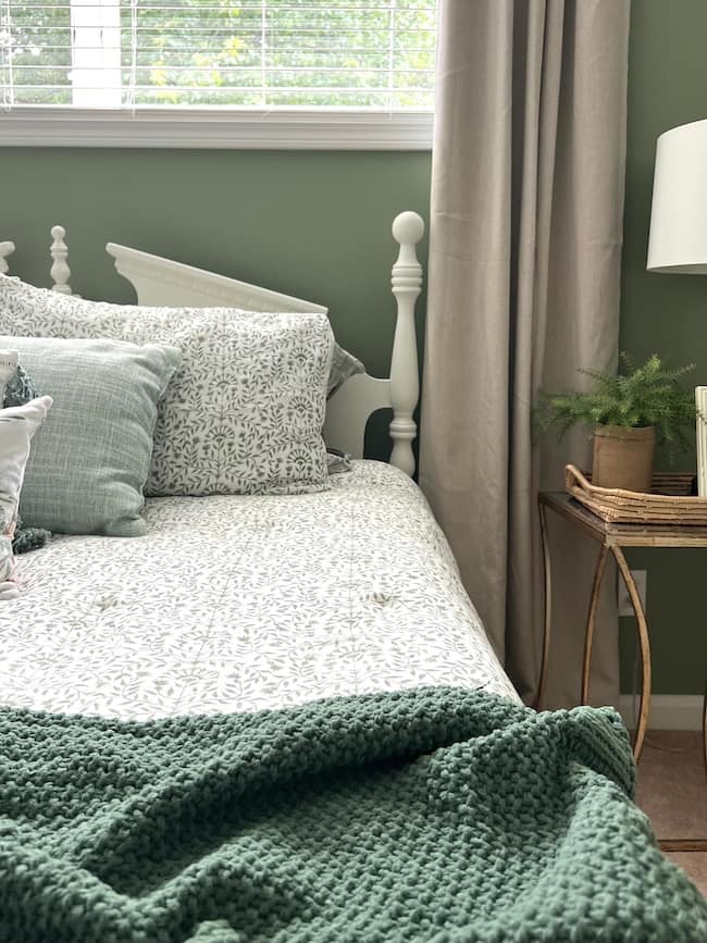
We used a pretty deep green, Sherwin-Williams Green Onyx (SW 9128), in our basement bedroom makeover. I love this gorgeous earthy color.
Here are more of my favorite moody green paint colors that will refresh and elevate your neutral spaces.
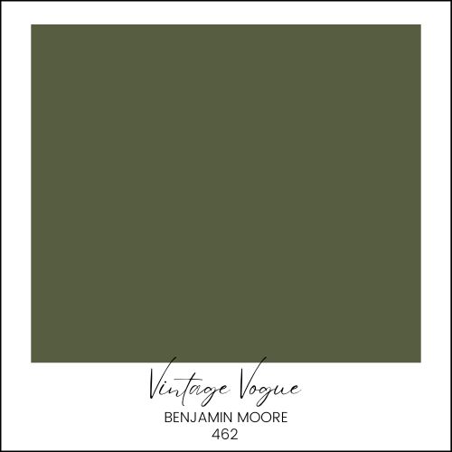
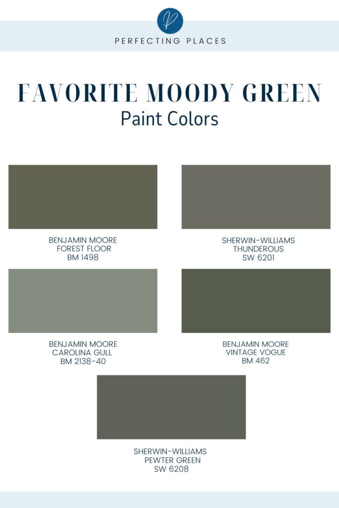
Benjamin Moore Vintage Vogue 462
Vintage Vogue is a rich, deep green that feels both classic and contemporary.
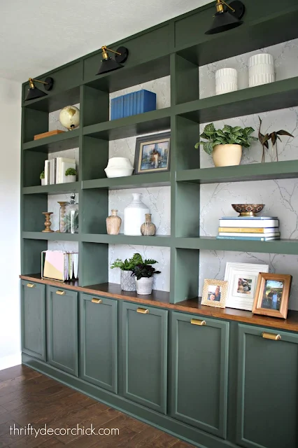
These DIY built-in bookcases by Thrifty Decor Chick are painted Vintage Vogue and are so gorgeous! Check out his fabulous DIY!
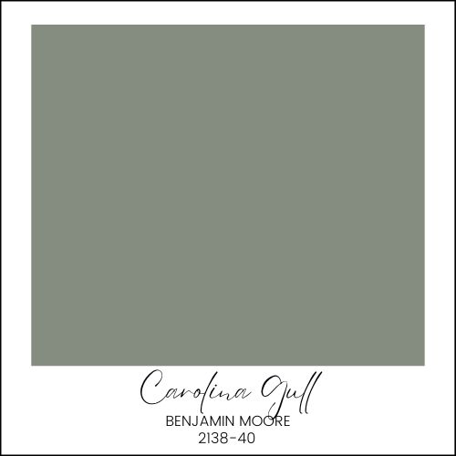
Benjamin Moore Carolina Gull 2138-40
Carolina Gull is a versatile, muted green with subtle gray undertones. I love this gorgeous shade of green! Look how pretty it in on these kitchen cabinets at House of Jade!
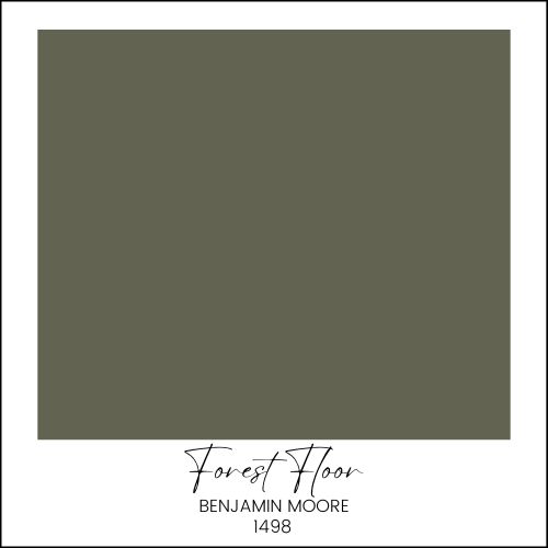
Benjamin Moore Forest Floor 1498
Forest Floor is a rich, lush green that brings the beauty of the outdoors inside. These kitchen cabinets painted Forest Floor at Jillian Harris are some of my favorites!
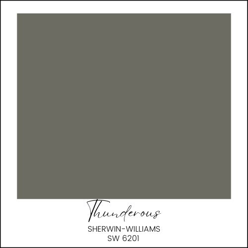
Sherwin-Williams Thunderous
The deep hue of Thunderous is perfect for accent walls or cabinetry, adding a dramatic touch to your home. This green is a much more neutral shade with a strong gray undertone. See how Chris Love Julia transformed their kitchen cabinets with this pretty color in their kitchen.
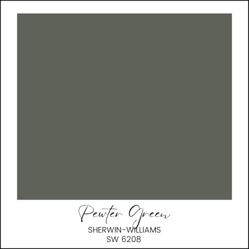
Sherwin-Williams Pewter Green
I fell in love with SW Pewter Green when I saw it in this Nashville Southern Living Idea House. These kitchen cabinets are so pretty in this timeless, earthy green with gray undertones!
Dark Neutral Moody Paint Colors: Warm Black and Charcoal Paint Colors
Warm moody blacks and charcoals are perfect for adding a cozy yet dramatic look in a room.
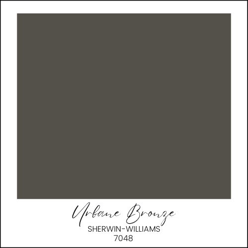
Sherwin-Williams Urbane Bronze (SW 7048)
I love this soft dark neutral in our home. Our interior front door is painted this color. Urbane Bronze is a warm, moody dark gray-brown that exudes elegance and depth. This shade is perfect for adding a touch of drama to your space without feeling too harsh.

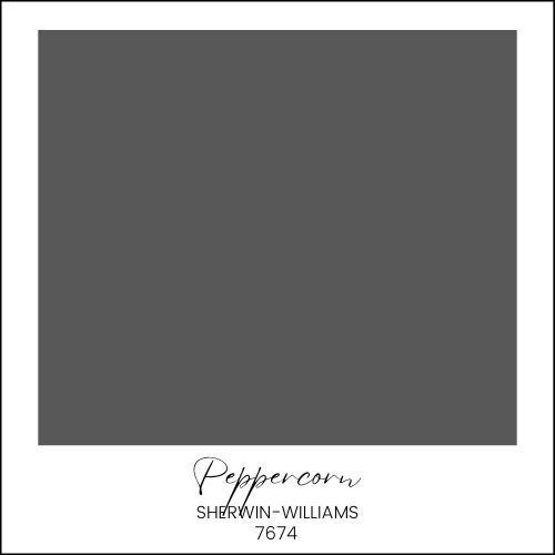
Sherwin-Williams Peppercorn
Peppercorn is a deep, rich charcoal that adds instant sophistication to any room. See beautiful examples of this color at The Creativity Exchange.
Simple Ways to Incorporate Moody Paint Colors Into Your Neutral Home
Have you seen all the gorgeous color-drenched rooms that are trending now where the walls, trim, built-ins, and even ceiling are that are completely wrapped in one deep moody color? They are beautiful and dramatic and definitely moody. You can see pretty examples here and here.
If you’re like me, and drenching an entire room in deep color feels a bit overwhelming to you, there are more gentle and subtle ways to introduce these stunning moody shades into your mostly neutral light-filled home.
Here are a few stylish ideas to get you started if you’re ready to add a little color depth to your home.
- Paint the backs of built-in bookshelves.
- Add a pop of moody color to the backs of your built-in bookshelves for a subtle touch that creates depth and interest without overwhelming the room.
- Create an accent wall.
- Make a statement by painting one wall in a moody color, such as behind the bed, sofa, or in the dining area, to add drama and contrast to a neutral space.
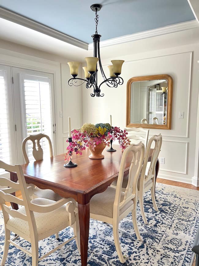
- Paint the ceiling.
- For a unique and cozy feel, consider painting the ceiling in a moody color.
- Paint cabinets and built-ins.
- Transform your kitchen or bathroom with moody-colored cabinets, or update built-ins in a home office or living room for a luxurious and sophisticated look.
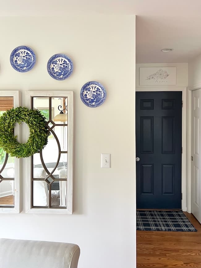
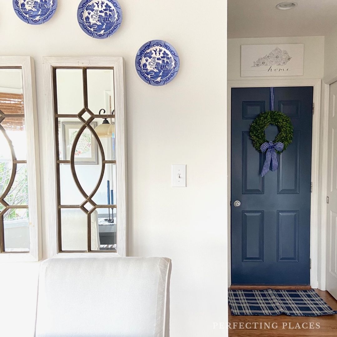
- Paint your interior doors.
- Update your home with chic, moody-colored interior doors to add elegance and character throughout your space. If you don’t want to paint all of your interior doors, just pick one focal door such as the front door in your foyer.
- Paint trim and moldings.
- Highlight architectural details by painting the trim and moldings in a moody color. This idea works beautifully in both contemporary and more traditional homes.
- Refresh old furniture with paint.
- Give new life to old furniture by painting it in a moody color, creating trendy and budget-friendly decor updates for dressers, side tables, or headboards.
- Paint accent nooks.
- Create cozy, inviting spaces by painting small nooks or alcoves in moody colors, perfect for reading corners, breakfast nooks, or small entryways.
These simple ideas help you incorporate moody paint colors into your home without committing to a full room transformation. They allow you to enjoy the beauty of these rich hues in a more understated manner.
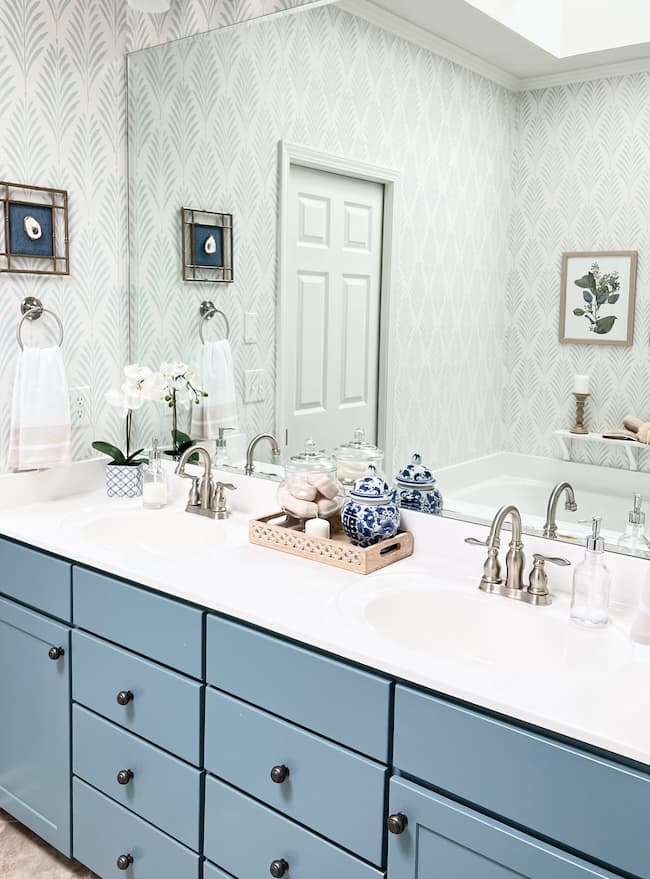
See how we updated our primary bathroom cabinets with the moody blue Blustery Sky by Sherwin-Williams.
So, are you starting to feel a little moody — in a good way? As you can see, there are so many lovely ways to add color depth to your rooms without full committing to moody color-filled rooms.
These beautiful rich moody blues, greens, and soft blacks, when carefully introduced in your home might just add the wow factor your rooms are waiting for!
Have you added a little moody color to your home? I’d love to know in the comments!
Happy Painting!


By the way, do you follow me on all the socials? If not, check out my Pinterest, Instagram, and Facebook and be sure to follow along so you don’t miss out on any of my decorating and DIY ideas.