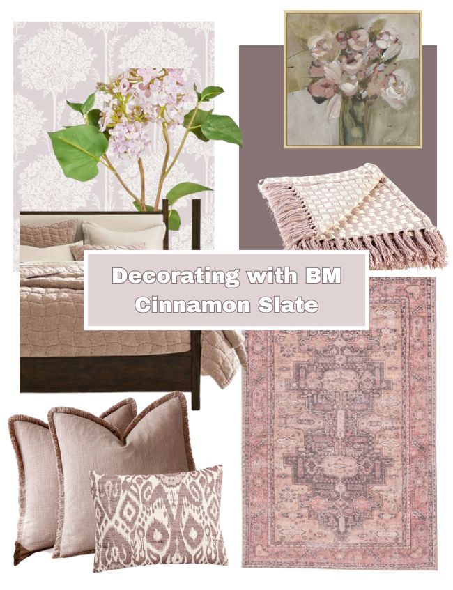
Cinnamon Slate Inspiration: Beautiful Decor Ideas for Your Home
Today, I’m talking all about Benjamin Moore’s 2025 Color of the Year, Cinnamon Slate. I’m sharing inspiration, mood board ideas, and decor finds to help you style this unique, moody color in your home
(This post contains affiliate links, so I may earn a small commission when you make a purchase through links on my site at no additional cost to you. As an Amazon Associate I earn from qualifying purchases.)
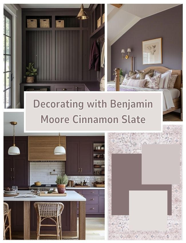
Benjamin Moore’s 2025 Color of the Year, Cinnamon Slate, is a deep, muted purple with rich brown undertones. It’s one of those shades that tends to be a “love it or leave it” color.
Personally, I don’t usually gravitate toward purples when decorating—unless it’s adding soft lavender, vibrant lilac, or the muted hues of fading hydrangeas in a flower arrangement. But if you’re considering a shade of purple that feels a little more understated, Cinnamon Slate might be worth a look.
The brown undertones ground the color, toning down the purple and giving it a more natural, earthy feel. It’s not the kind of bold purple that overwhelms a space, but rather a moody, sophisticated shade that can add depth when used thoughtfully.
It’s definitely a moody color, so if you love the idea of moody, color-drenched rooms, this could be one to try.
How to Use BM Cinnamon Slate in Your Home
I actually want to explore the different hues on the same paint color strip as Cinnamon Slate
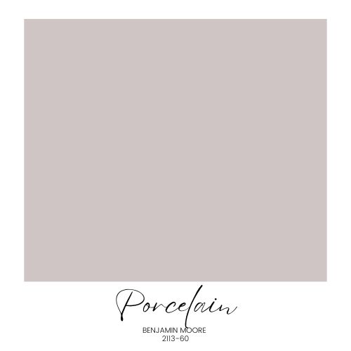
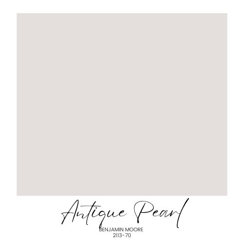
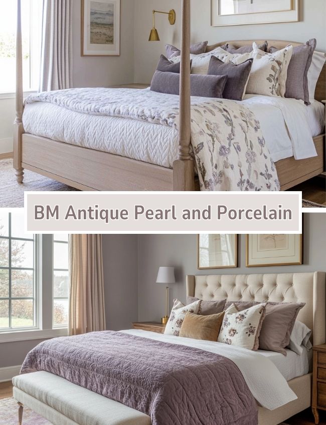
Benjamin Moore Porcelain and Antique Pearl
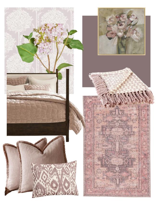
If I were incorporating Cinnamon Slate into my home, I’d tend to lean toward using the lighter shades on the same color strip for the walls—think soft, dusty lilacs that can add a vintage, soothing feel to a room. BM Porcelain and BM Antique Pearl are really pretty soft muted shades!
These lighter tones are especially beautiful in spaces like bedrooms, where you want a calm and peaceful atmosphere, but since they are lighter in hue they can also work in more open areas of your home, serving as more of a neutral.
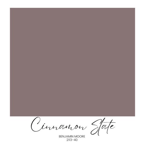
Benjamin Moore Cinnamon Slate
The deeper Cinnamon Slate shade, on the other hand, feels more suited for accents, trim, cabinetry, or on the walls of smaller, more intimate spaces such as a bedroom or office. It’s a moody color, and while it can be striking, it’s best used in ways that feel intentional and contained.
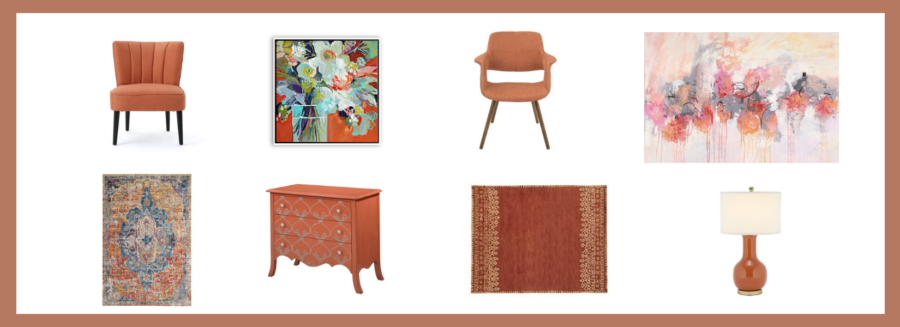
I’ve created some AI images below with rooms featuring similar colors to Cinnamon Slate. While the colors aren’t exact, you get the idea of how a dark, moody brownish purple could be used around your home in gorgeous ways!
Here are a few ideas for using Cinnamon Slate in your home:
- Painted Trim or Doors: Using Cinnamon Slate on trim, interior doors, or even cabinetry can add character and depth to a space.
- Color-Drenched Spaces: If you love the idea of color-drenching, Cinnamon Slate could work beautifully in a small, enclosed room—like a study or cozy bedroom. This deep shade creates an intimate atmosphere in small areas, but it might feel too heavy in large, open spaces.
- Check out how Chris and Julia, of Chris Loves Julia use a moody brownish purple in their daughter’s “big girl” room. The shade they chose is a little darker than Cinnamon Slate, but it gives an idea of how to use this moody purple color. They are master’s at using moody colors in a fresh, modern way!
- Vintage or Whimsical Accents: This color also lends itself well to vintage-inspired decor. Pair it with a floral wallpaper in softer tones for a layered, collected look. It could also be lovely on painted furniture.
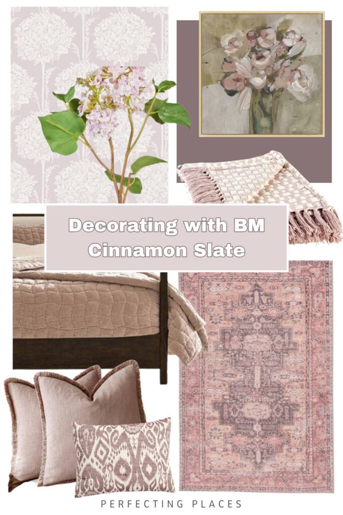
Decor Finds that Pair with Cinnamon Slate
To help visualize how this color could work in your home, I’ve pulled together some pretty home decor finds that complement Cinnamon Slate. I love to use varying shades of this color in a room for added depth and interest.

Wallpaper Ideas
I love these gorgeous wallpaper patterns to coordinate with muted moody purples!

Click on the images above for links to the products.
Bedding Ideas
From prints to solids, these quilts, duvets, and throws are gorgeous muted purples!
Click on the images above for links to the products.
Artwork Ideas
Accent your walls with artwork featuring muted purples and lavender!
Click on the images above for links to the products.
Area Rug Ideas
Make a statement with these gorgeous area rugs!
Click on the images above for links to the products.
Throw Pillow Ideas
Add touches of muted purple and lilac with pretty throw pillows! Add contrasting sage green for a lovely color combination!
Click on the images above for links to the products.
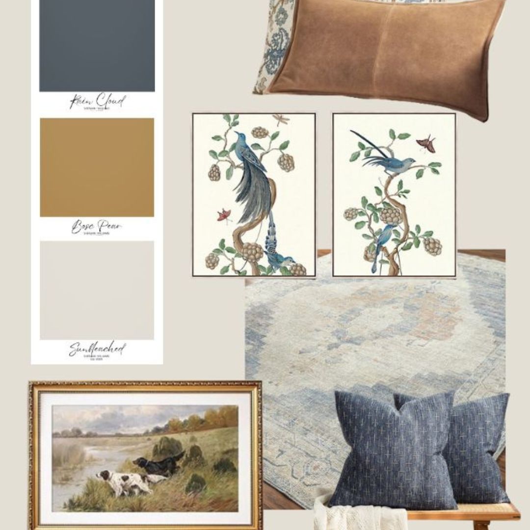
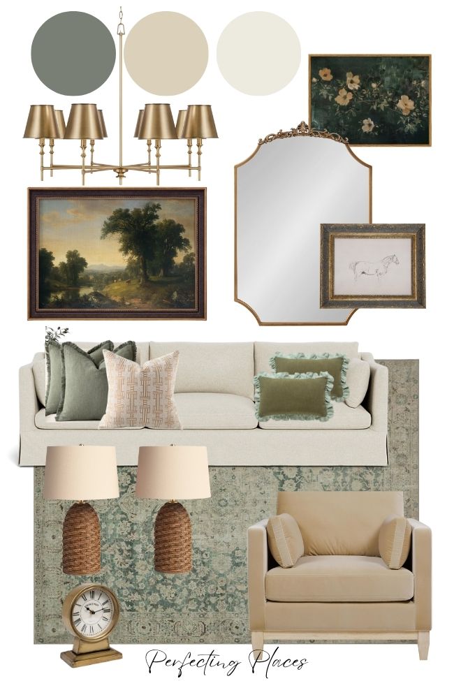
Pairing Cinnamon Slate with Vintage Sage Greens
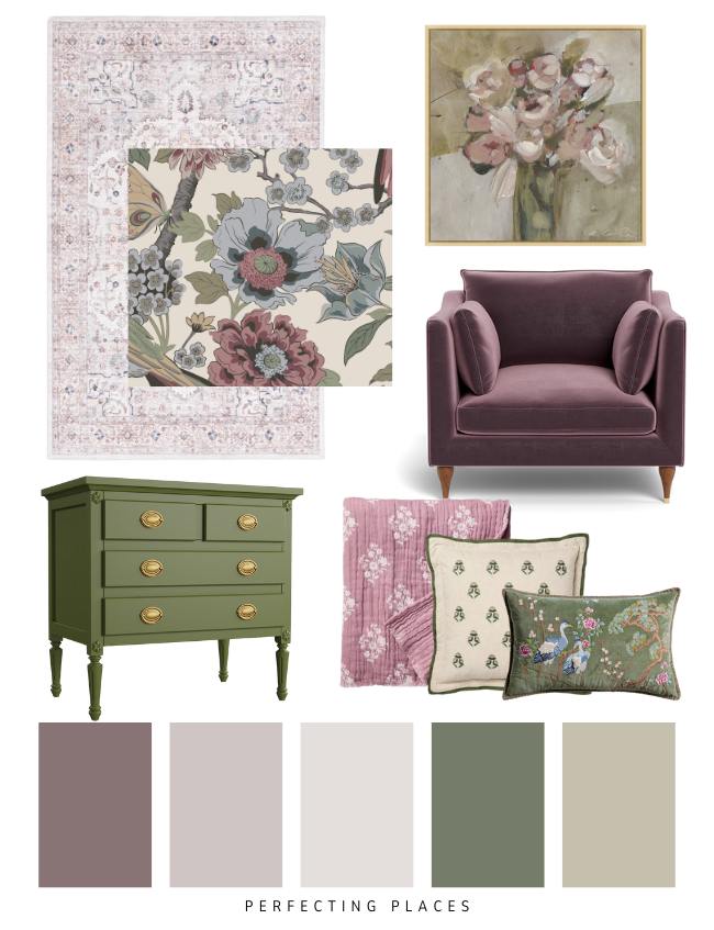
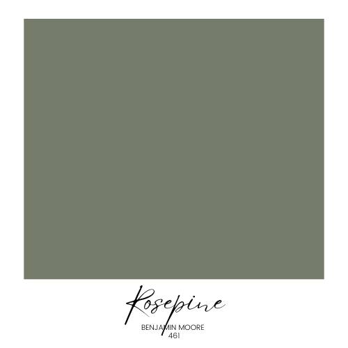
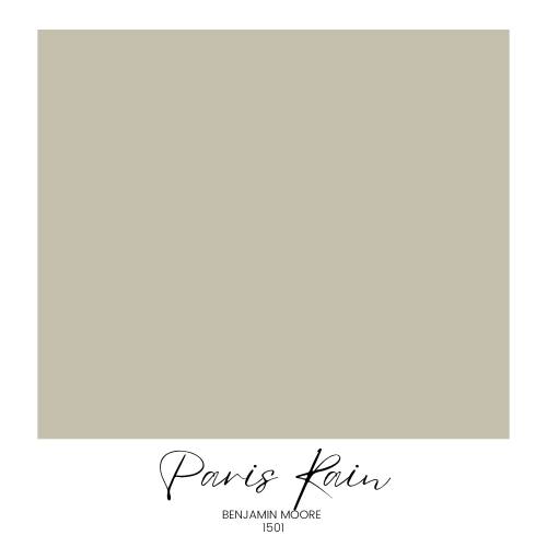
Cinnamon Slate’s rich, moody tone pairs beautifully with vintage-inspired sage greens. On my design board, I’ve combined it with lighter shades from the same color strip—Porcelain and Antique Pearl—for a soft, layered look. To add even more depth, I’ve included muted greens like Benjamin Moore’s Rosepine and Paris Rain.
These sage tones bring a natural, calming feel that balances the drama of Cinnamon Slate. Together, they create an earthy, vintage-inspired palette that’s perfect for bedrooms, living spaces, or even an intimate dining nook.
Shop the Look
Cinnamon Slate is one of those colors that can really surprise you. Whether you’re drawn to the deeper, moody shade for accents or prefer the lighter tones for a softer look, there are plenty of ways to make it work in your home.
Have you used Cinnamon Slate or a similar color in your space? I’d love to hear how you styled it! Let me know in the comments — it’s always fun to see how others are decorating.
And if you’re looking for more paint color ideas, be sure to check out the posts below!
More Paint Color Posts!

Thanks so much for stopping by!
Happy Decorating!